Tidying and joining data
We’re going to learn a couple new concepts while digging through this murders database: tidyr and joins. I’ve mentioned tidy data before briefly, and we’re going to get into it in this section.
Do you still have the murders data frame in the environment?
If not, run the command below:
source("import_murders.R")tidyr
Data can be messy but there’s an ideal structure for how to stack your data.
And that’s with
- Each variable is in its own column
- Each case is in its own row
- Each value is in its own cell
murders %>%
  group_by(State, Year) %>%
  summarize(cases=n(), solved=sum(Solved_value))
## # A tibble: 2,066 x 4
## # Groups: State [?]
## State Year cases solved
## <fct> <dbl> <int> <dbl>
## 1 Alaska 1976 47 37
## 2 Alaska 1977 47 32
## 3 Alaska 1978 50 44
## 4 Alaska 1979 51 35
## 5 Alaska 1980 47 37
## 6 Alaska 1981 69 62
## 7 Alaska 1982 75 47
## 8 Alaska 1983 74 63
## 9 Alaska 1984 52 45
## 10 Alaska 1985 50 36
## # ... with 2,056 more rowsThis type of data structure is easy to mutate and manipulate
murders %>%
  group_by(State, Year) %>%
  summarize(cases=n(), solved=sum(Solved_value)) %>%
  mutate(percent=solved/cases*100)
## # A tibble: 2,066 x 5
## # Groups: State [51]
## State Year cases solved percent
## <fct> <dbl> <int> <dbl> <dbl>
## 1 Alaska 1976 47 37 78.7
## 2 Alaska 1977 47 32 68.1
## 3 Alaska 1978 50 44 88
## 4 Alaska 1979 51 35 68.6
## 5 Alaska 1980 47 37 78.7
## 6 Alaska 1981 69 62 89.9
## 7 Alaska 1982 75 47 62.7
## 8 Alaska 1983 74 63 85.1
## 9 Alaska 1984 52 45 86.5
## 10 Alaska 1985 50 36 72
## # ... with 2,056 more rowsOn the other hand, the data below is not tidy.
## # A tibble: 6,198 x 4
## # Groups:   State [51]
##    State   Year type        n
##    <fct>  <dbl> <chr>   <dbl>
##  1 Alaska  1976 solved   37
##  2 Alaska  1976 percent  78.7
##  3 Alaska  1976 cases    47
##  4 Alaska  1977 solved   32
##  5 Alaska  1977 percent  68.1
##  6 Alaska  1977 cases    47
##  7 Alaska  1978 solved   44
##  8 Alaska  1978 percent  88
##  9 Alaska  1978 cases    50
## 10 Alaska  1979 solved   35
## # ... with 6,188 more rows
There are too many differing types– solved, percent, and cases should not be on the same column.
But sometimes you’ll get data from sources this way or your analysis will generate data like that.
Let’s take a look at the murders database again.
Look over the data frame and consider all the variables (columns) or dig through the data dictionary.
With the variables we have, what questions can we ask of it?
- MSA_label are Metropolitan Statistical Areas
- VicRace_label are races
- Note: This requires a huge grain of salt because what happens when you run
murders %>% group_by(VicRace_label) %>% count()? - Answer: There is no label for “Hispanic” victims
- Note: This requires a huge grain of salt because what happens when you run
- Solved_label are whether not the cases were solved
With this data, we could figure out which metro areas are solving murders at a higher rate for particular races than others. Sort of like for Where Killings Go Unsolved from The Washington Post. The data we’re working with isn’t as specific as the Post’s. They can identify clusters of murders down the the specific location because they have latitude and longitude data. We have data that’s generalized to counties and metro areas.
But it’s still enough for us to get started to identify cities where it’s a problem because unsolved killings can perpetuate cycles of violence in low-arrest areas.
We’re going to use the DT package to help work through this data. It brings in the DataTables jquery plug-in that makes it easier to interact with tables in R.
Let’s start broadly by finding the percent breakdown of solving cases in each metro area over the past 10 years.
# If you don't have DT installed yet, uncomment the line below and run it
#install.packages("DT")
library(DT)

unsolved <- murders %>%
  group_by(MSA_label, Solved_label) %>%
  filter(Year>2008) %>%
  summarize(cases=n())

datatable(unsolved)
Alright, so far, we’ve counted up the cases and the instances of them being solved or not.
Let’s use the mutate() function to calculate percents.
murders %>%
  group_by(MSA_label, Solved_label) %>%
  filter(Year>2008) %>%
  summarize(cases=n()) %>%
  mutate(percent=cases/sum(cases)*100) %>%
  datatable() # piping to the datatable function this time because it's more efficient
Getting closer, and though this data isn’t untidy, it’s not that easy to present.
What if your editor wanted to see which major metro areas ranked highest for percent of unsolved cases?
That’s easy for this data frame.
- Filter out cases where there are less than 10 cases to eliminate smaller metro areas
- Filter only the rows with “No” in the Solved_label column
- Drop the Solved_label because it’s redundant
- Arrange percent unsolved column from high to low
murders %>%
  group_by(MSA_label, Solved_label) %>%
  filter(Year>2008) %>%
  summarize(cases=n()) %>%
  filter(sum(cases)>10) %>%
  mutate(percent=cases/sum(cases)*100) %>%
  filter(Solved_label=="No") %>%
  select(Metro=MSA_label, cases_unsolved=cases, percent_unsolved=percent) %>%
  arrange(desc(percent_unsolved)) %>%
  datatable()
Interesting.
Chicago is unsurprising but I was not expecting Salinas, California.
Let’s keep going.
What happens if we dis aggregate the data by seeing if clearance rates are different depending on the race of the victim in those metro areas.
Let’s start out by adding VicRace_label into the group_by() code and figure out the percents.
murders %>%
  group_by(MSA_label, VicRace_label, Solved_label) %>%
  filter(Year>2008) %>%
  summarize(cases=n()) %>%
  mutate(percent=cases/sum(cases, na.rm=T)*100) %>%
  datatable()
Once again, your editor doesn’t care about your tidy data.
Give them something they can sort quickly to find a story.
Let’s clean it up like with the other data frame on metro areas.
# Also, we're going to round the percents with the round() function

race <- murders %>%
  group_by(MSA_label, VicRace_label, Solved_label) %>%
  filter(Year>2008) %>%
  summarize(cases=n()) %>%
  mutate(percent=cases/sum(cases)*100) %>%
  mutate(percent=round(percent, digits=2)) %>%
  filter(Solved_label=="No") %>%
  select(Metro=MSA_label, VicRace_label, cases_unsolved=cases, percent_unsolved=percent) %>%
  arrange(desc(percent_unsolved))

datatable(race)
Okay, we’re getting closer. But the race values are throwing off the sorting. We need to transform this tall data and make it wide.
spread()
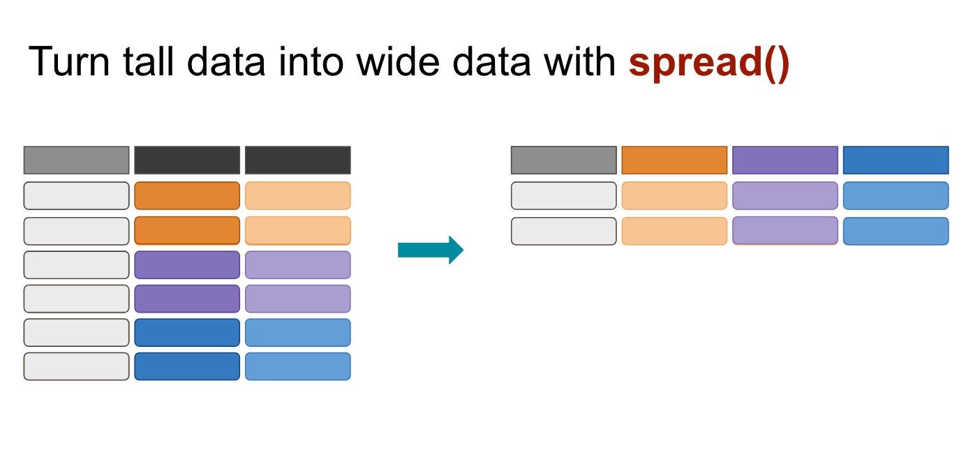
The spread() function in the tidyr package moves values into column names.
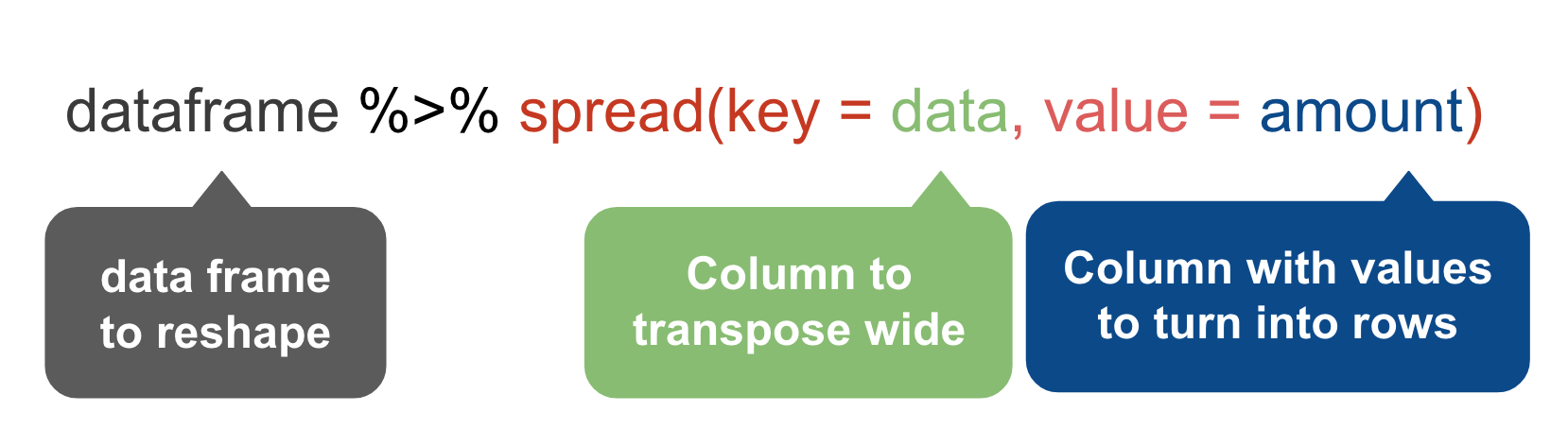
We want to move the values of the VicRace_label and turn them into columns while preserving the values in percent_unsolved
# We've saved our previous steps into the "race" dataframe
# So we can continue our steps because they've been saved

race %>%
  spread(VicRace_label, percent_unsolved) %>%
  datatable()
Oh no!
What happened!?
See, spread() can only turn one tall column wide at a time.
We need to drop the cases_unsolved column in order for this to transpose correctly.
That’s fine, though. We’ll come back for it later on.
Let’s try again.
# This time we'll drop the cases_unsolved column before spreading

race_percent <- race %>%
  select(-cases_unsolved) %>%
  spread(VicRace_label, percent_unsolved)

datatable(race_percent)
gather()
Alright, we’ve performed some magic here but making something disappear isn’t enough. We have to bring it back.
What if you have data that’s in a wide format and want to make it tall for analysis or visualization purposes?
Three reasons why you should attempt to structure your data in long (tall) form:
- If you have many columns, it’s difficult to summarize it at a glance and see if there are any mistakes in the data.
- Key-value pairs facilitates conceptual clarity
- Long-form datasets are required for graphing and advanced statistical analysis

The first two arguments specify a key-value pair: race is the key and percent_unsolved the value. The third argument specifies which variables in the original data to convert into the key-value combination (in this case, all variables from Asian or Pacific Islander to White).
# So 2:6 represents the column index, or where the columns are in the data frame-- so columns 2 through 6
race_percent %>%
  gather("Race", "Percent_Unsolved", 2:6) %>%
  arrange(desc(Metro)) %>%
  datatable()
## Instead of numbers you can use column names
## This is a reminder that to reference column names with spaces, you have to use the ` back tick around the column names
race_percent %>%
gather("Race", "Percent_Unsolved", `Asian or Pacific Islander`:White) %>%
arrange(desc(Metro)) %>%
datatable()Okay, we’ve digressed long enough.
Let’s get back to our data analysis.
race_percent %>% arrange(desc(Black)) %>% datatable()See anything interesting?
We’ve arranged the data frame by descending percent unsolved this time.
Dalton, GA and McAllen-Edinburg-Mission, TX have 100 percent unsolved rates for Black victims.
That’s a big deal, right?
Well, that depends on how many total victims there were– which this table doesn’t provide.
We used to have that data but we had to get rid of it when we used spread() on it a few steps earlier.
Aha, we stored it as race so it should still be in your environment.
Let’s copy and paste the code from above to to restore it (yay, reproducibility!).
race_percent <- race %>%
  select(-cases_unsolved) %>%
  spread(VicRace_label, percent_unsolved)

datatable(race_percent)
So it looks like we dropped cases_unsolved and kept percent_unsolved for spreading.
Let’s reverse that and drop percent_unsolved and keep the cases_unsolved instead.
Once again, we can copy and paste the code we used and make a little adjustment in the select() and spread() functions:
race_cases <- race %>%
  select(-percent_unsolved) %>%
  spread(VicRace_label, cases_unsolved)

datatable(race_cases)
The original problem was that the race_percent did not have the contextual information of how many cases there were to determine if the percents listed were significant or not.
We’ve created two new data frames race_percent and race_cases and they each have what we need.
So let’s bring those two together.
Joining
A join combines two data sets by adding the columns of one data set alongside the columns of the other, usually some of the rows of the second data set along with some rows of the first data set.
A successful join requires something consistent between two data sets to match on: keys.
What are the keys that the *race_percent and race_cases** can join on? Take a look.
What’s consistent about each of them? Column names, sure.
But also the Metro areas.
The dplyr package has quite a few functions we can use.
Let’s start with:
left_join()
In all joins, you pass two variables: the first one is the target data frame and the second one is the data frame you’re bringing over. By default the function will look to join on column names that are the same (You can join by more than one column name, by the way). You can also specify which column the columns should join by.
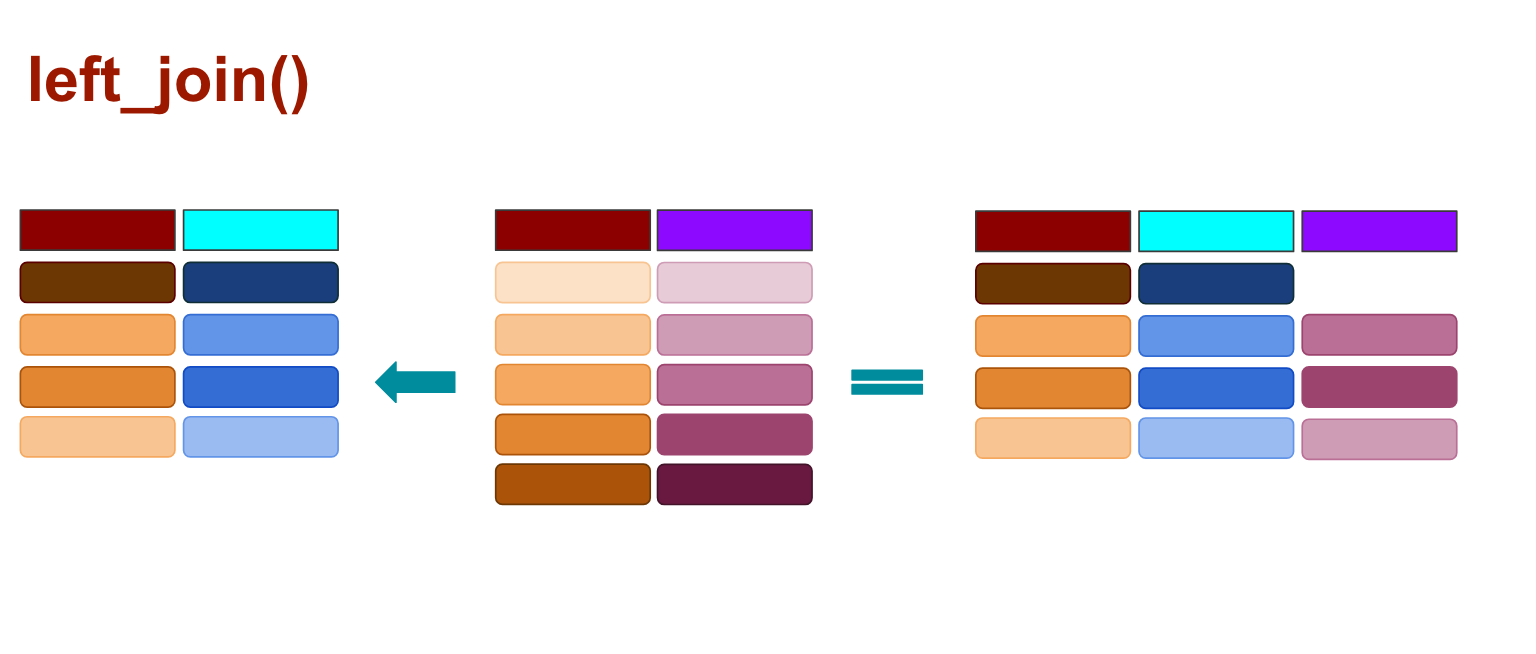
When you use left_join() any rows from the second data frame that doesn’t match the target data frame are dropped, as illustrated above.
Let’s try it out.
# If we don't use the by variable it would match nothing because the column names are the exact same for both data frames

wide1 <- left_join(race_percent, race_cases, by="Metro")
View(wide1)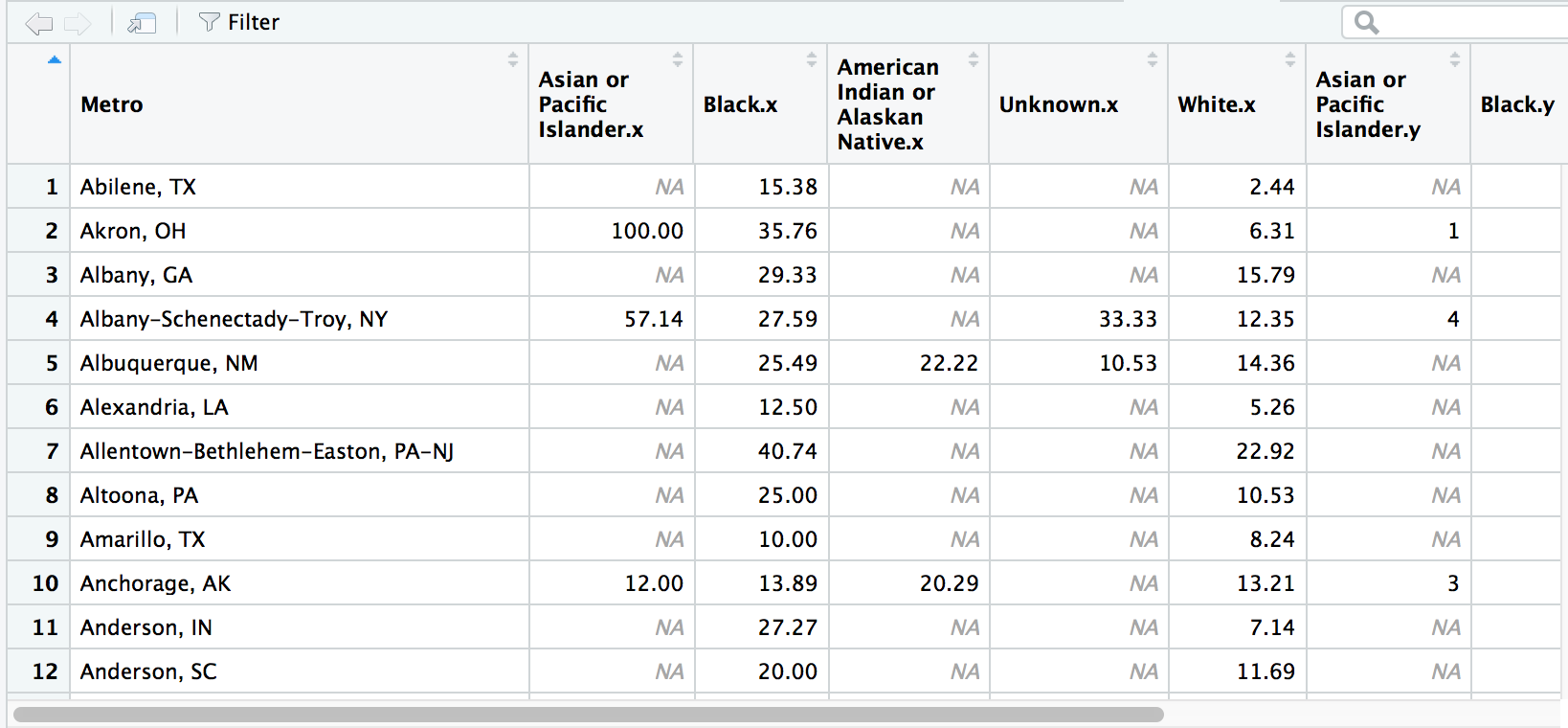
Hey, it worked! And the column names were automatically renamed to avoid duplicates.
So let’s clean it up.
We can use select() to rename and reorder the columns of the data frame so the race data are grouped.
Let’s also arrange the cases in descending Black unsolved percent like in one of our steps above.
# Don't forget: If there are spaces in the column names, you have to use the ` back tick.

wide2 <- left_join(race_percent, race_cases, by="Metro") %>%
  select(Metro,
         `Asian cases`=`Asian or Pacific Islander.y`,
         `Asian percent`=`Asian or Pacific Islander.x`,
         `Native American cases`=`American Indian or Alaskan Native.y`,
         `Native American percent`=`American Indian or Alaskan Native.x`,
         `Black cases`=Black.y,
         `Black percent`=Black.x,
         `White cases`=White.y,
         `White percent`=White.x,
         `Unknown cases`=Unknown.y,
         `Unknown percent`=Unknown.x
         ) %>%
  arrange(desc(`Black percent`))
View(wide2)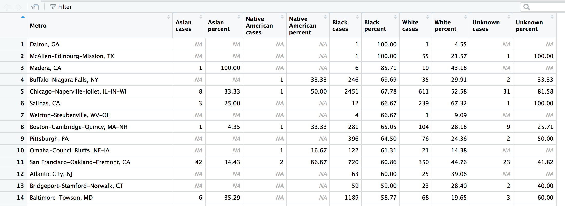
Alright, so remember how we wondered if 100 percent unsolved cases for Black victims in Dalton, GA and , TX were a big deal? It turns out there was only 1 victim each in those towns– so that skews the results.
But skip down to Buffalo-Niagara Falls, NY in the fourth row. There were 353 Black victims and 246 cases (about 70 percent) went unsolved. Move a couple columns over and you see that there were 35 White victims and the rate of unsolved was 30 percent. That’s a pretty big disparity.
Even one row below in Chicago, the unsolved rate for Blacks and Whites is 68 and 53 percent, respectively. What’s going on in Buffalo? This might be a story worth reporting if you’re from the area or are looking for this type of disparity across the country?
I know we need to move on to learn about other ways to join data but I just wanna do a quick analysis– which is possible thanks to what you’ve already learned with dplyr!
Let’s just do a quick analysis with our new wide2 data frame.
We want to find
- Which towns have the biggest disparity in unsolved cases between Black and White victims.
- Let’s also filter out cases, at say, 10
- Get rid of the other columns so can focus on what we’re looking for
wide2 %>%
  filter(`Black cases` >=10 & `White cases`>=10) %>%
  mutate(Black_White=`Black percent`-`White percent`) %>%
  select(Metro, `Black cases`, `White cases`, `Black percent`, `White percent`, Black_White) %>%
  arrange(desc(Black_White)) %>%
  datatable()
Interesting. Buffalo-Niagara Falls, NY is actually third for disparity.
Omaha-Council Bluffs, NE-IA and Pittsburgh, PA are worst.
Alright, alright, back to the joins.
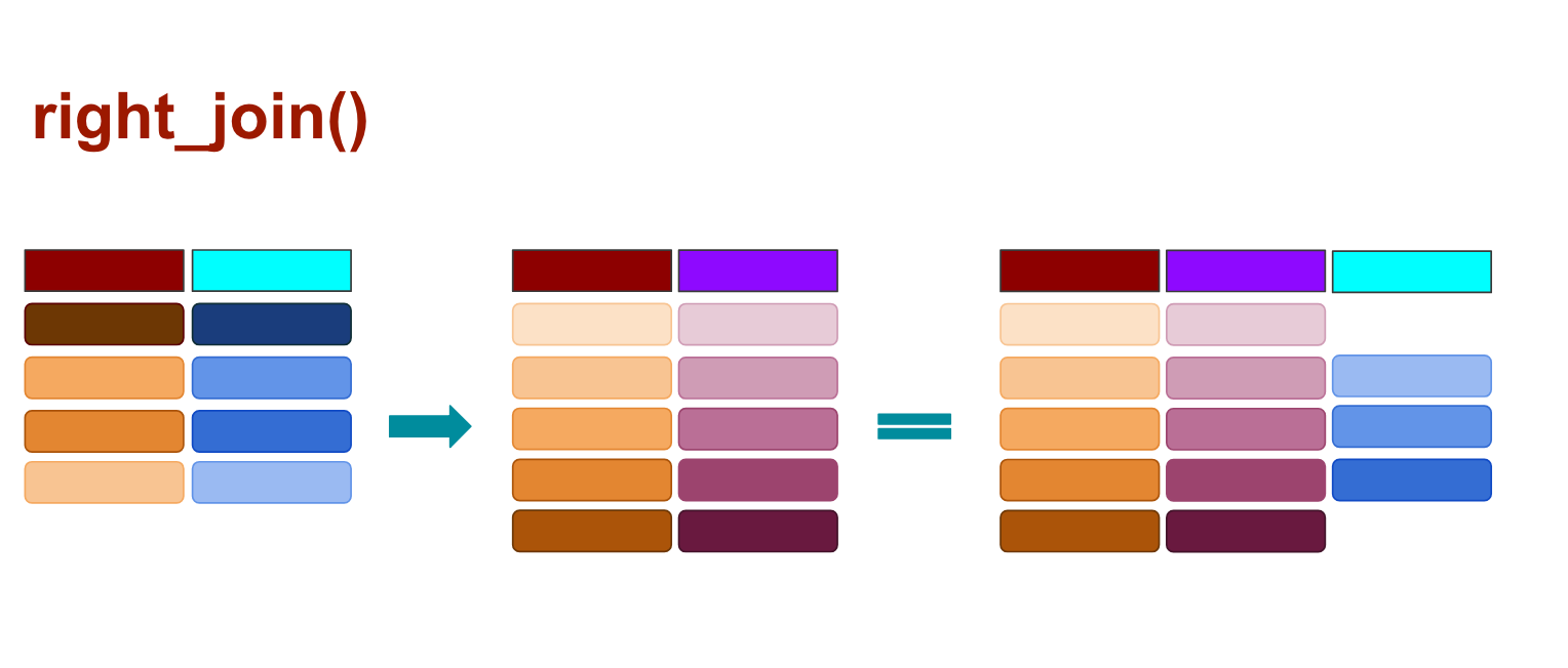
When you use right_join() any rows from the second data frame that doesn’t match the target data frame are kept, and those that don’t match from the original data frame are dropped, as illustrated above.
left <- data.frame(company=c("Mars", "Hershey", "Cadbury",  "Mondelez", "Haribo"),
                   candy=c("Skittles", "M&Ms", "Starbar", "Toblerone", "Goldbaren"))
right <- data.frame(company=c("Hershey", "Mondelez", "Cadbury", "Mars", "Colosinas Fini"),
                    location=c("Pennsylvania", "Switzerland", "Britain", "New Jersey", "Spain"))
left
## company candy
## 1 Mars Skittles
## 2 Hershey M&Ms
## 3 Cadbury Starbar
## 4 Mondelez Toblerone
## 5 Haribo Goldbarenright## company location
## 1 Hershey Pennsylvania
## 2 Mondelez Switzerland
## 3 Cadbury Britain
## 4 Mars New Jersey
## 5 Colosinas Fini Spain# We don't have to use by="column_name" this time because both data frames only have one matching column name to join on: Company
right_join(left, right)## Joining, by = "company"## Warning: Column `company` joining factors with different levels, coercing
## to character vector## company candy location
## 1 Hershey M&Ms Pennsylvania
## 2 Mondelez Toblerone Switzerland
## 3 Cadbury Starbar Britain
## 4 Mars Skittles New Jersey
## 5 Colosinas Fini <NA> Spain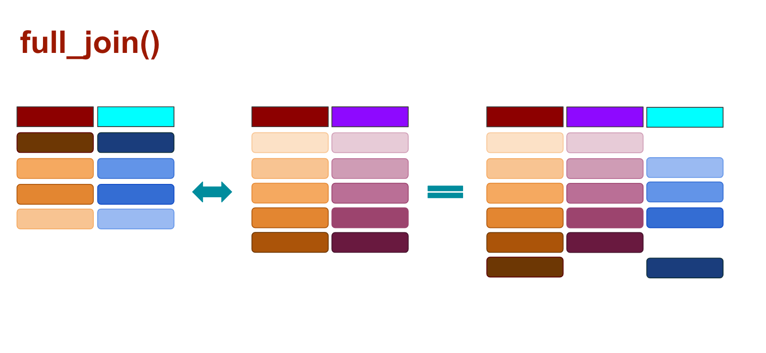
When you use full_join() any rows from the second data frame that doesn’t match the target data frame are kept, and so are the rows that don’t match from the original data frame, as illustrated above.
full_join(left, right)## Joining, by = "company"## Warning: Column `company` joining factors with different levels, coercing
## to character vector## company candy location
## 1 Mars Skittles New Jersey
## 2 Hershey M&Ms Pennsylvania
## 3 Cadbury Starbar Britain
## 4 Mondelez Toblerone Switzerland
## 5 Haribo Goldbaren <NA>
## 6 Colosinas Fini <NA> Spain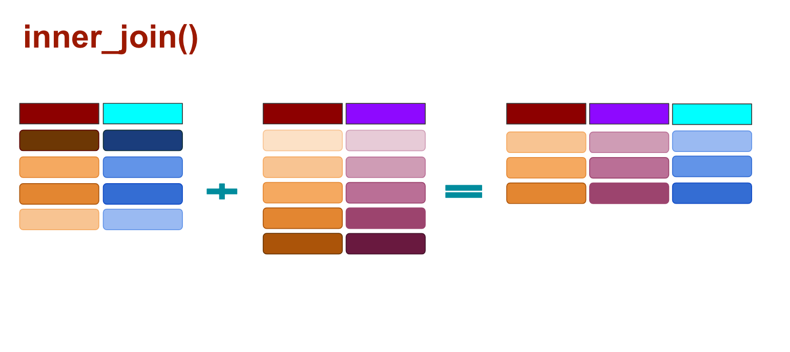
And with inner_joins() any rows that don’t match are dropped completely from both data sets.
inner_join(left, right)## Joining, by = "company"## Warning: Column `company` joining factors with different levels, coercing
## to character vector## company candy location
## 1 Mars Skittles New Jersey
## 2 Hershey M&Ms Pennsylvania
## 3 Cadbury Starbar Britain
## 4 Mondelez Toblerone SwitzerlandThere are a few other joins that we won’t get into now, like semi_join() and anti_join().
Whew, we went through a lot of stuff in this section.
gather()spread()left_join()right_join()full_join()- and
inner_join()
And we learned those neat things by exploring the murders data set.
Wanna dig into it further and put on your criminal profiler hat?
Let’s move onto the next section where we’ll do more data wrangling and algorithm translating and maybe some serial killer tracking.
Your turn
Challenge yourself with these exercises so you’ll retain the knowledge of this section.
Instructions on how to run the exercise app are on the intro page to this section.
© Copyright 2018, Andrew Ba Tran