Customizing charts
Let’s bring that data back in again.
library(readr)

ages <- read_csv("data/ages.csv")
Remember that Dot Plot we made before?
library(ggplot2)

ggplot(ages,
       aes(x=actress_age, y=Movie)) +
  geom_point()
It’s not that great, right? It’s in reverse alphabetical order.
Let’s reorder it based on age.
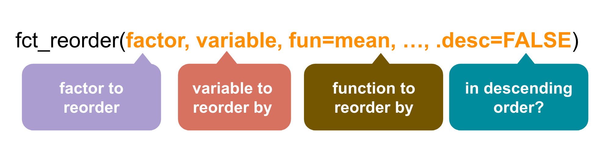
Reordering chart labels
This means we need to transform the data.
The easiest way to do this is with the package forcats, which (surprise!) is also part of the tidyverse universe.
The function is fct_reorder() and it works like this
# If you don't have forcats installed yet, uncomment the line below and run
# install.packages("forcats")

library(forcats)
ggplot(ages,
       aes(x=actress_age, y=fct_reorder(Movie, actress_age, desc=TRUE))) +
  geom_point()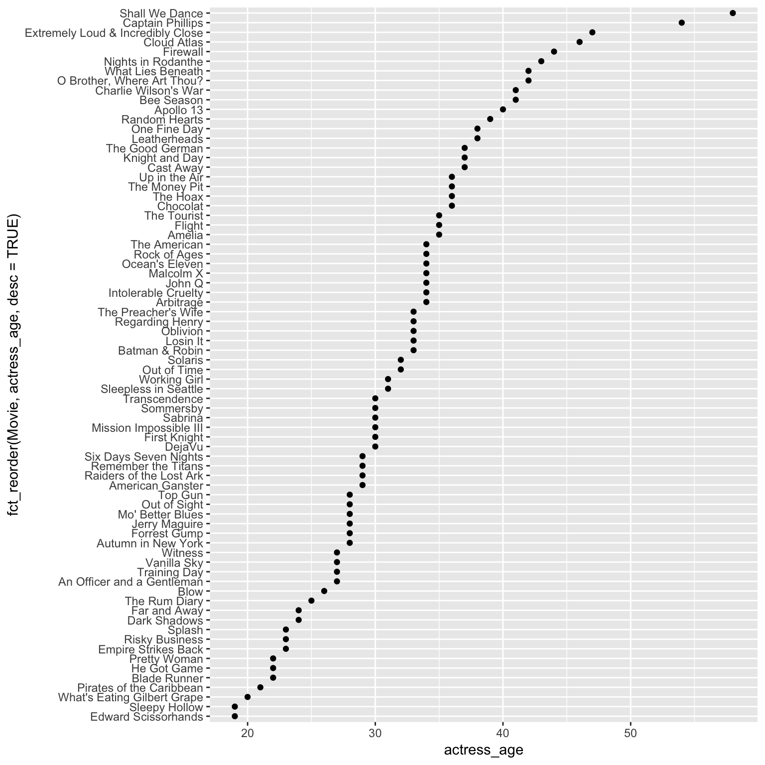
Not a bad looking chart. We can tweak it a little more and turn it into
Lollipop plot
This time we’re going to use a new geom_: geom_segment()
ggplot(ages,
       aes(x=actress_age, y=fct_reorder(Movie, actress_age, desc=TRUE))) +
  geom_segment(
       aes(x = 0,
           xend = actress_age,
           yend = fct_reorder(Movie, actress_age, desc=TRUE)),
           color = "gray50") +
           geom_point()
Looking interesting, right?
If we wanted to publish this on a website or share on social media, we’ll need to clean up the labels and add a title and add a source line.
That’s easy to do.
ggplot(ages,
       aes(x=actress_age, y=fct_reorder(Movie, actress_age, desc=TRUE))) +
  geom_segment(
       aes(x = 0,
           y=fct_reorder(Movie, actress_age, desc=TRUE),
           xend = actress_age,
           yend = fct_reorder(Movie, actress_age, desc=TRUE)),
           color = "gray50") +
           geom_point() +
# NEW CODE BELOW
  labs(x="Actress age", y="Movie",
       title = "Actress ages in movies",
       subtitle = "for R for Journalists class",
       caption = "Data from Vulture.com and IMDB") +
  theme_minimal()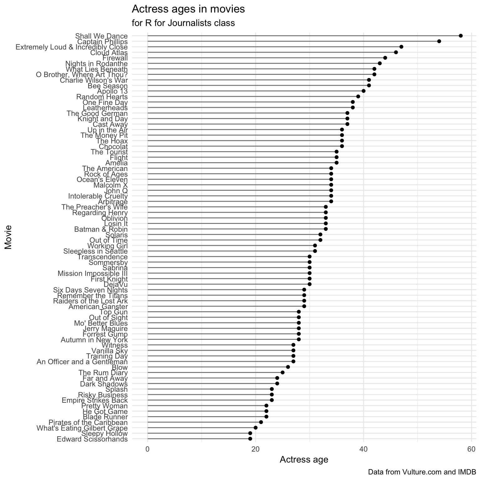
So we added a lot of information to the labs() function: x, y, title, subtitle, and caption.
We also added theme_minimal() which changed a lot of the style, such as the gray grid background.
What if we wanted to clean it up even more?
It’s such a tall chart, it’s difficult to keep track of the actual age represented by the lollipop.
Let’s get rid of the grids and add the numbers to the right of each dot.
ggplot(ages,
       aes(x=actress_age, y=fct_reorder(Movie, actress_age, desc=TRUE))) +
  geom_segment(
       aes(x = 0,
           y=fct_reorder(Movie, actress_age, desc=TRUE),
           xend = actress_age,
           yend = fct_reorder(Movie, actress_age, desc=TRUE)),
           color = "gray50") +
           geom_point() +
  labs(x="Actress age", y="Movie",
       title = "Actress ages in movies",
       subtitle = "for R for Journalists class",
       caption = "Data from Vulture.com and IMDB") +
  theme_minimal() +
  # NEW CODE BELOW
  geom_text(aes(label=actress_age), hjust=-.5) +
  theme(panel.border = element_blank(),
        panel.grid.major = element_blank(),
        panel.grid.minor = element_blank(),
        axis.line = element_blank(),
        axis.text.x = element_blank())
So, we added two new ggplot2 elements: geom_text() and theme().
We passed the actress_age variable to label and also used hjust= which means horizontally adjust the location. Alternatively, vjust would adjust vertically.
In theme() there are a bunch of things passed, including panel.border and axis.text.x and made them equal element_blank().
Each piece of the chart can be customized and eliminated with *element_blank().
Not bad looking!
Let’s save it.
Saving ggplots
We’ll use ggsave() from the ggplot2 package.
File types that can be exported:
- png
- tex
- jpeg
- tiff
- bmp
- svg
You can specify the width of the image in units of “in”, “cm”, “or mm”.
Otherwise it saves based on the size of how it displayed on your screen.
ggsave("actress_ages.png")## Saving 7 x 5 in imageHow’s it look?

Ew, okay. Needs some adjustment. I guess we can’t go with the default display for this particular chart.
ggsave("actress_ages_adjusted.png", width=20, height=30, units="cm")
Much better!
You could then save it as a .svg file and tweak it even further in Adobe Illustrator or Inkscape.
Alright, I’m going to tweak it some more by adding actor ages. We just need to adjust the geom_segment() and another geom_point() layer so it uses the actor_age variable.
# First, let's permanently reorder the data frame so we don't have to keep using fct_reorder

library(dplyr)

ages_reordered <- ages %>%
  mutate(Movie=fct_reorder(Movie, desc(actor_age)))

ggplot(ages_reordered) +
  geom_segment(
       aes(x = actress_age,
           y = Movie,
           xend = actor_age,
           yend = Movie),
           color = "gray50") +
  geom_point(aes(x=actress_age, y=Movie), color="dark green") +
  geom_point(aes(x=actor_age, y=Movie), color="dark blue") +
  labs(x="", y="",
       title = "Actor and actress ages in movies",
       subtitle = "for R for Journalists class",
       caption = "Data from Vulture.com and IMDB") +
  theme_minimal() +
  geom_text(aes(x=actress_age, y=Movie, label=actress_age), hjust=ifelse(ages$actress_age<ages$actor_age, 1.5, -.5)) +
  geom_text(aes(x=actor_age, y=Movie, label=actor_age), hjust=ifelse(ages$actress_age<ages$actor_age, -.5, 1.5)) +
  theme(panel.border = element_blank(),
        panel.grid.major = element_blank(),
        panel.grid.minor = element_blank(),
        axis.line = element_blank(),
        axis.text.x = element_blank())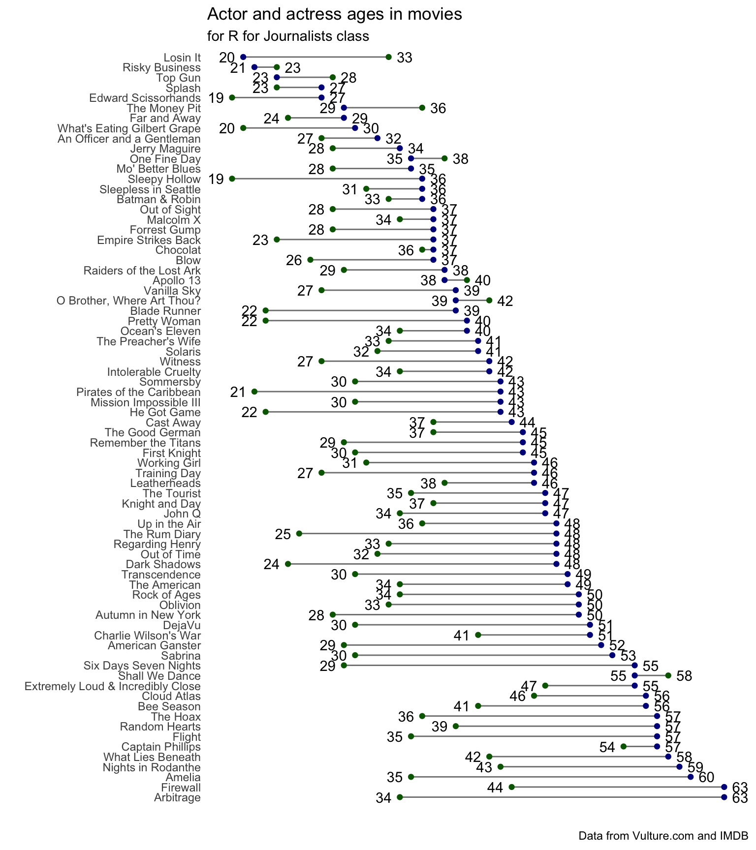
This time I left the x and y axis labels blank because it seemed redundant.
Scales
Let’s talk about scales.
Axes
scale_x_continuous()scale_y_continuous()scale_x_discrete()scale_y_discrete()
Colors
scale_color_continuous()scale_color_manual()scale_color_brewer()
Fill
scale_fill_continuous()scale_fill_manual()
ggplot(ages, aes(x=actor_age, y=actress_age)) + geom_point() +
  scale_x_continuous(breaks=seq(20,30,2), limits=c(20,30)) +
  scale_y_continuous(breaks=seq(20,40,4), limits=c(20,40))
## Warning: Removed 67 rows containing missing values (geom_point).
By setting breaks in scale_x_continuous(), we limited the breaks where the chart was divided on the x axis in intervals of 2. And we limited the x axis with limit between 20 and 30. All other data points were dropped.
By setting breaks in scale_y_continuous(), we limited the breaks where the chart was divided on the x axis in intervals of 4. And we limited the x axis with limit between 20 and 40. All other data points were dropped.
That was limiting the scale by continuous data.
Here’s how to set limits on discrete data.
ggplot(ages, aes(x=actor)) + geom_bar() +
  scale_x_discrete(limits=c("Tom Hanks", "Tom Cruise", "Denzel Washington"))
## Warning: Removed 43 rows containing non-finite values (stat_count).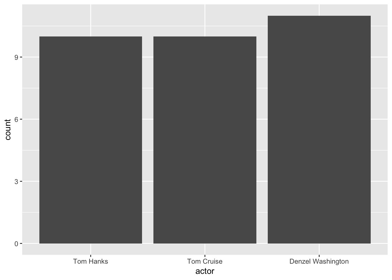
Scales for color and fill
It’s possible to manually change the colors of your chart.
You can use hex symbols or the name of a color if it’s recognized.
We’ll use scale_fill_manual().
library(dplyr)
avg_age <- ages %>%
group_by(actor) %>%
mutate(age_diff = actor_age-actress_age) %>%
summarize(average_age_diff = mean(age_diff))
ggplot(avg_age, aes(x=actor, y=average_age_diff, fill=actor)) +
geom_bar(stat="identity") +
theme(legend.position="none") + # This removes the legend
scale_fill_manual(values=c("aquamarine", "darkorchid", "deepskyblue2", "lemonchiffon2", "orange", "peachpuff3", "tomato"))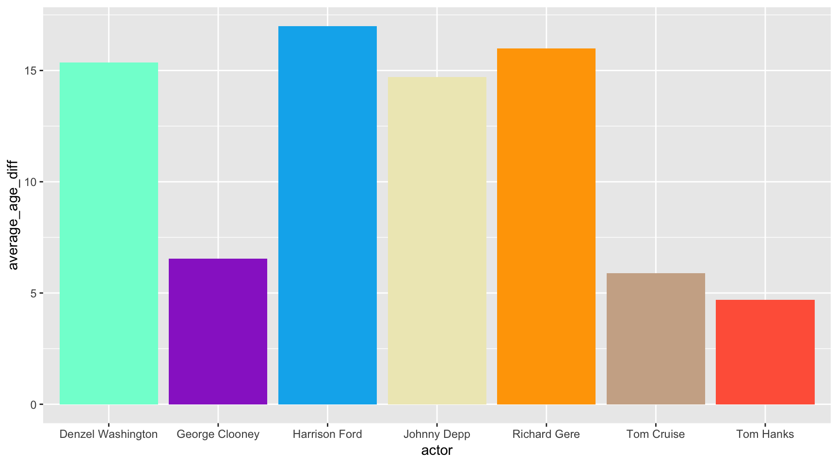 You can also specify a color palette using
 scale_fill_brewer() or scale_color_brewer()
ggplot(avg_age, aes(x=actor, y=average_age_diff, fill=actor)) +
  geom_bar(stat="identity") +
  theme(legend.position="none") +
  scale_fill_brewer()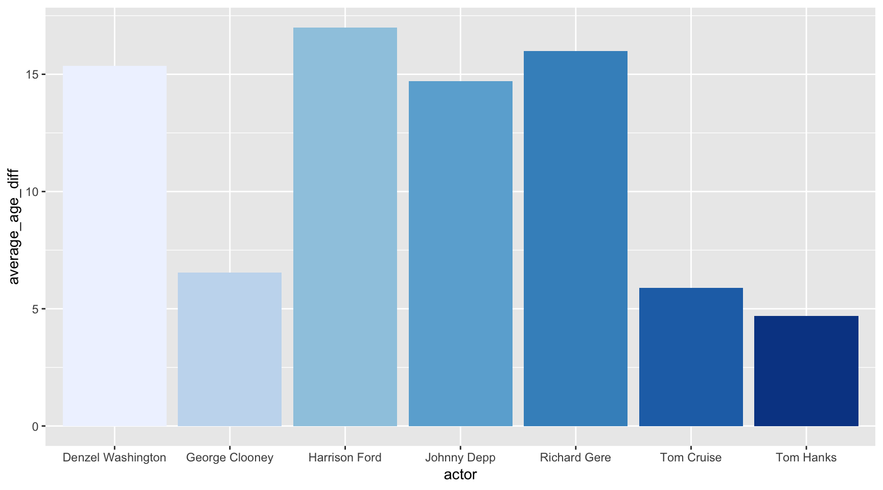
Check out some of the other palette options that can be passed to brewer.
ggplot(avg_age, aes(x=actor, y=average_age_diff, fill=actor)) +
  geom_bar(stat="identity") +
  theme(legend.position="none") +
  scale_fill_brewer(palette="Pastel1")
Did you know that someone made a Wes Anderson color palette package based on his different movies?
Annotations
You can annotate charts with annotate() and geom_hline() or geom_vline().
ggplot(ages, aes(x=actor_age, y=actress_age)) +
  geom_point() +
  geom_hline(yintercept=50, color="red") +
  annotate("text", x=40, y=51, label="Random text for some reason", color="red")
Themes
You’ve seen an example of a theme used in a previous chart. theme_bw().
But there are many more that have been created and collected into the ggthemes library.
Here’s one for the economist
# If you don't have ggthemes installed yet, uncomment the line below and run it
#install.packages("ggthemes")

library(ggthemes)
ggplot(ages, aes(x=actor_age, y=actress_age, color=actor)) +
  geom_point() +
  theme_economist() +
  scale_colour_economist()
Here’s one based on FiveThirtyEight’s style (though it’s not the official one).
ggplot(ages, aes(x=actor_age, y=actress_age, color=actor)) +
  geom_point() +
  theme_fivethirtyeight()
Check out all the other ones currently available.
It’s not difficult to make your own. It’s just time consuming.
It involves tweaking every little detail, like text, and colors, and how the grids should look.
Check out the theme that the Associated Press uses. They posted it on their repo and by loading their own package, they can just add theme_ap() at the end of their charts to transform it to AP style.
Your turn
Challenge yourself with these exercises so you’ll retain the knowledge of this section.
Instructions on how to run the exercise app are on the intro page to this section.
© Copyright 2018, Andrew Ba Tran