More charts
We’re going to go over some examples of visualizations created with packages that people have created to build on top of ggplot2. People love improving and building upon things. The latest version of ggplot2 was released recently and more than 300 people contributed– either by adding pieces from their add-on packages or by suggesting fixes.
gghighlight
The gghighlight package is a relatively new addition. In the previous section, I showed a way to surface important data while keeping the background data for context. This package simplifies it. Learn more on their site.
We’ll use historical monthly average temperature data from the National Centers for Environmental Information.
This is the image they have on their site illustrating their data:

We can do better.
Start with importing and transforming the data below:
# If you don't have readr installed yet, uncomment and run the line below
# install.packages("readr")

library(readr)

temps <- read_csv("data/110-tavg-all-5-1895-2018.csv", skip=4)
head(temps)
## # A tibble: 6 x 3
## Date Value Anomaly
## <int> <dbl> <dbl>
## 1 189501 26.7 -3.43
## 2 189502 26.6 -7.22
## 3 189503 40.0 -1.53
## 4 189504 52.9 1.85
## 5 189505 59.9 -0.26
## 6 189506 67.8 -0.69# If you don't have readr installed yet, uncomment and run the line below
# install.packages("lubridate")
# If you don't have lubridate installed yet uncomment the line below and run it
#install.packages("lubridate")
# NOTE: IF YOU GET AN ERROR ABOUT NOT HAVING A PACKAGE CALLED stringi
# UNCOMMENT AND RUN THE LINES BELOW IF YOU HAVE A WINDOWS MACHINE
#install.packages("glue", type="win.binary")
#install.packages("stringi", type="win.binary")
#install.packages("stringr", type="win.binary")
#install.packages("lubridate", type="win.binary")
# UNCOMMENT AND RUN THE LINES BELOW IF YOU HAVE A MAC MACHINE
#install.packages("glue", type="mac.binary")
#install.packages("stringi", type="mac.binary")
#install.packages("stringr", type="mac.binary")
#install.packages("lubridate", type="mac.binary")
library(lubridate)
# Converting the date into a date format R recognizes
# This requires using paste0() to add a day to the date, so 189501 turns into 18950101
temps$Date <- ymd(paste0(temps$Date, "01"))
# Extracting the year
temps$Year <- year(temps$Date)
# Extracting the month
temps$month <- month(temps$Date)
temps$month <- as.numeric(temps$month)
temps$month_label <- month(temps$Date, label=T)
# Creating a column with rounded numbers
temps$rounded_value <- round(temps$Value, digits=0)
# Turning the year into a factor so it'll chart easier
temps$Year <- as.factor(as.character(temps$Year))
head(temps)## # A tibble: 6 x 7
## Date Value Anomaly Year month month_label rounded_value
## <date> <dbl> <dbl> <fct> <dbl> <ord> <dbl>
## 1 1895-01-01 26.7 -3.43 1895 1 Jan 27
## 2 1895-02-01 26.6 -7.22 1895 2 Feb 27
## 3 1895-03-01 40.0 -1.53 1895 3 Mar 40
## 4 1895-04-01 52.9 1.85 1895 4 Apr 53
## 5 1895-05-01 59.9 -0.26 1895 5 May 60
## 6 1895-06-01 67.8 -0.69 1895 6 Jun 68Now we have some tidy data to visualize.
# If you don't have readr installed yet, uncomment and run the line below
# install.packages("ggplot2")

library(ggplot2)

ggplot(temps, aes(x=month, y=Value, group=Year)) +
  geom_line() +
  scale_x_continuous(breaks=seq(1,12,1), limits=c(1,12)) +
  theme_minimal() +
  labs(y="average temperature", title="Monthly temperature since 1895", caption="Source: NOAA")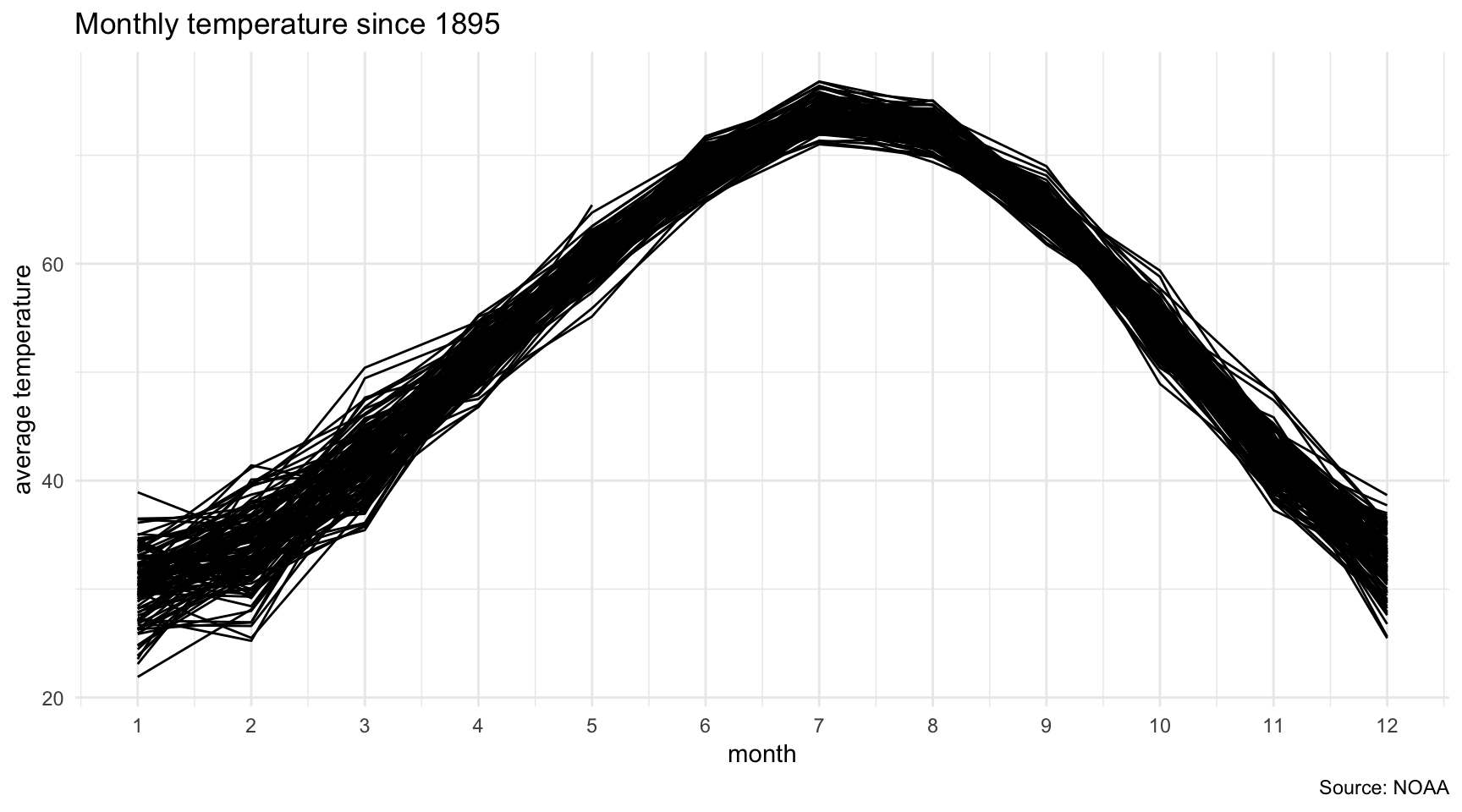
Let’s use the gghighlight package to make this clearer to readers.
If you get an error about ggplot_add then try this link which suggests you run devtools::install_github(“r-lib/rlang”, build_vignettes = TRUE) before rerunning install.packages(“gghighlight”)
# If you don't have readr installed yet, uncomment and run the line below
# install.packages("gghighlight")

library(gghighlight)

# adding some alpha to the line so there's some transparency
ggplot(temps, aes(x=month, y=Value, color=Year)) +
  geom_line(alpha=.08) +
  scale_x_continuous(breaks=seq(1,12,1), limits=c(1,12)) +
  theme_minimal() +
  labs(y="average temperature", title="Monthly temperature since 1895", caption="Source: NOAA") +
  # NEW CODE BELOW
  gghighlight(max(as.numeric(Year)), max_highlight = 4L)
## label_key: Year
ggrepel
Did you like those labels for years on the chart?
That comes from the ggrepel package. The geom_label_repel() lets you add those button labels to charts and, as the name implies, it makes sure the labels do not collide or stack on top of each other.
Let’s take a look at the dataframe from the first ggplot section.
We’ll make a labeled chart with ggplot2 as is.
ages <- read_csv("data/ages.csv")

# We'll focus on the movies from the Toms

# If you don't have dplyr or stringr installed yet, uncomment and run the lines below
#install.packages("dplyr")
#install.packages("stringr")

library(dplyr)
library(stringr)

toms <- ages %>%
  filter(str_detect(actor, "Tom"))

ggplot(data=toms,
       aes(x=actor_age,
           y=actress_age,
           color=actor,
           label=Movie)) +
      geom_point() +
      theme_minimal() +
      labs(y="Actress age", x="Actor age", title="Tom Hanks versus Tom Cruise ages", caption="Source; Vulture.com, IMDB") +
geom_text() 
This is one of the main criticisms of making charts programmatically. These labels look horrible. That creating charts via scripts requires exporting as an SVG file and refining in Adobe Illustrator to make sure the labels look just right.
And I’m not saying you shouldn’t use whatever tool you want to make charts look perfect.
It’s just that the community understand these issues and are working together to come up with creative ways to handle it.
Let’s try the same code above with the new function geom_text_repel() from the ggrepel package.
# if you don't have the ggrepel package installed yet, uncomment and run the line below
#install.packages("ggrepel")

library(ggrepel)

ggplot(data=toms,
       aes(x=actor_age,
           y=actress_age,
           color=actor,
           label=Movie)) +
      geom_point() +
      theme_minimal() +
      labs(y="Actress age", x="Actor age", title="Tom Hanks versus Tom Cruise ages", caption="Source; Vulture.com, IMDB") +
      geom_text_repel()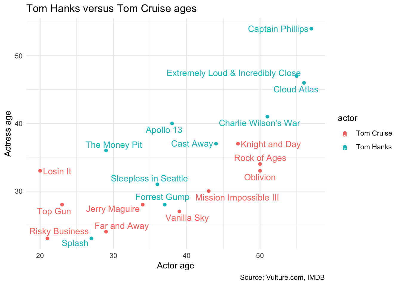
Not bad for one line of code.
ridgeplot
# If you don't have ggridges or viridis installed yet, uncomment and run the lines below
#install.packages("ggridges")
#install.packages("viridis")

library(ggridges)
library(viridis)

ggplot(temps, aes(x=rounded_value, y=month_label, fill = ..x..)) +
  geom_density_ridges_gradient(scale=3, rel_min_height = 0.01) +
  scale_fill_viridis(name="Temp. [F]", option="C") +
  labs(title="Average temperatures since 1895", y="", x="Temperature", caption="Source: NOAA") +
  theme_minimal()
Neat. Let’s try it with the actor ages database.
ggplot(ages, aes(x=actress_age, y=actor, fill = ..x..)) +
  geom_density_ridges_gradient(scale=2, rel_min_height = 0.01) +
  scale_fill_viridis(name="Actress age", option="C") +
  labs(title="Distribution of actress ages for each actor", y="", x="Actress age", caption="Source: Vulture.com, IMDB") +
  theme_minimal()
## Picking joint bandwidth of 3.19
heatmap
You can make some interesting charts with geom_tile() and it’s already part of ggplot2, no extension needed. Let’s use Global Land and Ocean Temperature Anomalies with respect to the 20th century average since 1880.
anom <- read_csv("data/1880-2018.csv", skip=4)
head(anom)
## # A tibble: 6 x 2
## Year Value
## <int> <dbl>
## 1 188001 0
## 2 188002 -0.13
## 3 188003 -0.13
## 4 188004 -0.05
## 5 188005 -0.07
## 6 188006 -0.17anom$Date <- ymd(paste0(anom$Year, "01"))
# Extracting the year
anom$Year <- year(anom$Date)
# Extracting the month
anom$month <- month(anom$Date)
anom$month <- as.numeric(anom$month)
anom$month_label <- month(anom$Date, label=T)
# Turning the year into a factor so it'll chart easier
anom$Year <- as.factor(as.character(anom$Year))
library(forcats)
anom <- anom %>%
mutate(Year=fct_rev(factor(Year)))ggplot(anom, aes(y=Year, x=month_label, fill=Value)) +
geom_tile(color="white", width=.9, height=1.1) +
theme_minimal() +
scale_fill_gradient2(midpoint=0, low="blue", high="red", limits=c(-1.3, 1.3)) +
labs(title="Global Land and Ocean Temperature Anomalies", x="", y="", caption="Source: NOAA", fill="Anomaly") +
scale_x_discrete(position = "top") +
theme(legend.position="top")
Mr. Rogers
Did you know that someone sat down and identified the colors of every single sweater that Mr. Rogers wore?
Well, Owen Phillips scraped it with R and created and visualized it using ggplot2.
Check out his well-documented code that is hosted on GitHub.
In the meantime, you can recreate the chart by importing the csv below and then running the ggplot2 functions.
# This code is pretty much from Owen Phillips

rogers <- read_csv("data/mrrogers.csv")
rogers$episodenumbers <- as.factor(rogers$episodenumbers)
rogers$colorcodes <- as.factor(rogers$colorcodes)

cn <- levels(rogers$colorcodes)


na.omit(rogers) %>% ggplot(aes(x=episodenumbers)) + geom_bar(aes(fill = factor(colorcodes))) +
  scale_fill_manual(values = cn) + theme_minimal() +
  labs(fill = "", x= "",
       title = "Mister Rogers' Cardigans of Many Colors",
       subtitle = " ",
       caption = "") +
  guides(fill=guide_legend(ncol=2)) +
  scale_x_discrete(breaks = c(1466, 1761),
                   labels = c("1979", "2001")) +
  theme(axis.title.y=element_blank(), axis.text.y=element_blank(), axis.ticks.y=element_blank()) +
  theme(legend.position = "none") + ylim(0,1)
Time is a flat circle
This visualization is by John Muyskens of the Washington Post. He created this exploratory graphic using school shootings data before refining it in D3 and publishing it. It should be noted that the final chart uses methodology to estimate attendance based on enrollment figures that differs from what is shown here.
# uncomment and run the lines below to install the right packages

#install.packages("ggbeeswarm")
#devtools::install_github("AliciaSchep/gglabeller")
#install.packages("scales")
#install.packages("readr")

library(ggbeeswarm)
library(gglabeller)
library(scales)

library(readr)

data <- read_csv("https://github.com/washingtonpost/data-school-shootings/raw/master/school-shootings-data.csv",
  col_types = cols(date = col_date(format = "%m/%d/%Y")))

theeeeme <- theme_minimal() + theme(
  axis.text.y=element_blank(),
  axis.ticks=element_blank(),
  axis.line.y=element_blank(),
  panel.grid=element_blank())

ggplot(data, aes(date, 0, size=enrollment)) +
  geom_beeswarm(method = "frowney", groupOnX=FALSE, dodge.width=0.5, alpha=0.5) +
  scale_size_area(max_size = 8) +
  scale_x_date(date_breaks="1 year", labels=date_format("%Y"), limits=as.Date(c('1998-04-01', '2023-04-01'))) +
  scale_y_continuous(limits=c(-20, 10)) +
  coord_polar(direction = -1) +
  theeeeme
The final published version:

© Copyright 2018, Andrew Ba Tran