Static maps
In this section we’re going to go over the basics of spatial data, shape files, and various ways to map Census data.
Spatial data can be difficult to wrap your head around at first.
I’ll describe it briefly as best I can before we move on to how journalists use it in their work process. But I hope you’ll look up more details later on as you come to appreciate it more.
There are two underlying important pieces of information for spatial data:
- Coordinates of the object
- How the coordinates relate to a physical location on Earth
- Also known as coordinate reference system or CRS
There are two types of CRS:
- Geographic
- Uses three-dimensional model of the earth to define specific locations on the surface of the grid
- longitude (East/West) and latitude (North/South)
- Projected
- A translation of the three-dimensional grid onto a two-dimensional plane

There are so many map projections to choose from. The one you’ve probably been exposed to the most is Mercator (also known as WGS84) on Google Maps.
If you’ve worked with projections, then you’ve probably already seen this famous West Wing clip.
Raster versus Vector data
Spatial data with a defined CRS can either be vector or raster data.
- Vector
- Based on points that can be connected to form lines and polygons
- Located with in a coordinate reference system
- Example: Road map
- Raster
- Are values within a grid system
- Example: Satellite imagery
This class will focus on vector data and the sf package. An older package, sp, lets a user handle both vector and raster data. It also takes much more effort to get your system ready for it (shakes fist at gdal). The main differences between the sp and sf packages are how they store CRS information. While sp uses spatial sub classes, sf stores data in data frames, allowing it to interact with dplyr methods we’ve learned so far. I encourage you to check out other spatial data analysis and modeling classes if you remain interested in this afterward.
Shape files
R can handle importing different kinds of file formats for spatial data, including KML and geojson. We’ll focus on shape files, which was created by ESRI in the ’90s.
Though we refer to a shape file in the singular, it’s actually a collection of at least three basic files:
- .shp - lists shape and vertices
- .shx - has index with offsets
- .dbf - relationship file between geometry and attributes (data)
All files must be present in the directory and named the same (except for the file extension) to import correctly.
The plan
We’ll walk through several methods for dealing with spatial data, each time improving on the style a little bit.
- Map blank shape file after downloading
- Join Census data to blank shape file and map
- Use R package Tigris to download shape file
- Use R package censusapi to download census data and join to new shape file
- Use tidycensus to download Census data and the shape file all at once
Let’s use the sf package in conjunction with ggplot2 to visualize the data.
There are performance issues when creating maps with the sf package if you’re using a Mac. To fix, download and install XQuartz. Restart and then run these commands: options(device = “X11”) and then X11.options(type = “cairo”)
Mapping a simple shape file
We’ll start by reading in a shape file of state boundaries from the Census.
# If you haven't installed ggplot2 or sf yet, uncomment and run the lines below
#install.packages("ggplot2")
#install.packages("sf")

library(ggplot2)
library(sf)

# If you're using a Mac, uncomment and run the lines below
#options(device = "X11")
#X11.options(type = "cairo")

fifty_location <- "data/cb_2017_us_state_20m/cb_2017_us_state_20m.shp"
fifty_states <- st_read(fifty_location)
## Reading layer `cb_2017_us_state_20m' from data source `/Users/andrewtran/Projects/learn-r-journalism/content/mapping/static_maps/data/cb_2017_us_state_20m/cb_2017_us_state_20m.shp' using driver `ESRI Shapefile'
## Simple feature collection with 52 features and 9 fields
## geometry type: MULTIPOLYGON
## dimension: XY
## bbox: xmin: -179.1743 ymin: 17.91377 xmax: 179.7739 ymax: 71.35256
## epsg (SRID): 4269
## proj4string: +proj=longlat +datum=NAD83 +no_defsView(fifty_states)
We pointed to the shape file and used the st_read() function to import it.
ggplot(fifty_states) + geom_sf()
Well, that’s interesting. We have the boundaries of each state, including Hawaii and Alaska.
And ggplot2 is doing its best to fit everything on one image. Which is taxing on the system.
Also, there are no colors because we don’t have any data to fill with.
Let’s pull in population data from CensusReporter.org
# If you don't have readr installed yet, uncomment and run the line below
#install.packages("readr")

library(readr)
populations <- read_csv("data/acs2016_1yr_B02001_04000US55.csv")
View(populations)
Join data to blank shapefile and map
We have a shape file and a data set of populations. They’re both data frames so should be easy to join. State names are where the data sets can join on. The column names for each data frame is different for state names, but we can account for that easily.
ncol(fifty_states)## [1] 10library(dplyr)
fifty_states <- left_join(fifty_states, populations,
by=c("NAME"="name"))ncol(fifty_states)## [1] 31Excellent. We went from 10 variables in fifty_states to 31.
There are a lot of variable names in this data frame. Check them out.
colnames(fifty_states)## [1] "STATEFP" "STATENS" "AFFGEOID"
## [4] "GEOID" "STUSPS" "NAME"
## [7] "LSAD" "ALAND" "AWATER"
## [10] "geoid" "B02001001" "B02001001, Error"
## [13] "B02001002" "B02001002, Error" "B02001003"
## [16] "B02001003, Error" "B02001004" "B02001004, Error"
## [19] "B02001005" "B02001005, Error" "B02001006"
## [22] "B02001006, Error" "B02001007" "B02001007, Error"
## [25] "B02001008" "B02001008, Error" "B02001009"
## [28] "B02001009, Error" "B02001010" "B02001010, Error"
## [31] "geometry"Alright, this is good to go over now.
- STATEFP is the state fips code.
- That stands for the Federal Information Processing Standard. It’s a standardized way to identify states, counties, census tracts, etc.
- GEOID is also part of the fips code.
- In this instance it’s only two digits wide.
- The more specific you get into the Census boundaries, the longer the number gets.
- B02001001, B02001002, etc.
- This is reference to a Census table of information.
- For example, B02001001 is total population for that polygon of data in that row
- When you export data from the Census, the variables get translated to this sort of format
- You’ll have to remember when you download it or look it up.
- B02001001, Error
- Margin of error included because these are just estimates, after all
- geometry
- This is the CRS data
Let’s map it with geom_sf() and fill it with the population variable B02001001. And we’ll filter out Hawaii and Alaska for now because it’ll slow things down if we don’t. Sorry! We’ll bring them back in later, I promise.
forty_eight <- fifty_states %>%
  filter(NAME!="Hawaii" & NAME!="Alaska" & NAME!="Puerto Rico")


ggplot(forty_eight) +
  geom_sf(aes(fill=B02001001)) +
  scale_fill_distiller(direction=1, name="Population") +
  labs(title="Population of 48 states", caption="Source: US Census")
Not bad. Very basic. Notice that the x and y axis are latitude and longitude.
So we’ve gone over how to bring in shape files and data locally, join them, and how to map it.
There’s a more efficient way of dealing with shape files if you know what you’re looking for.
Downloading shape files directly into R
Let’s use the tigris package, which lets us download Census shapefiles directly into R without having to unzip and point to directories, etc. Here’s a pretty thorough introduction from the package creator, Kyle Walker.
Shape files can be downloaded simply by referring to them as a function such as
tracts()counties()school_districts()roads()
First, let’s make sure the shape files download as sf files (because it can also handle sp versions, as well)
# If you don't have tigris installed yet, uncomment the line below and run
#install.packages("tigris")

library(tigris)

# set sf option

options(tigris_class = "sf")

tx <- counties("TX", cb=T)

#If cb is set to TRUE, download a generalized (1:500k) counties file. Defaults to FALSE (the most detailed TIGER file).

# Excluding Non-Continguous states (sorry!)

ggplot(tx) +
  geom_sf() +
  theme_void() +
  theme(panel.grid.major = element_line(colour = 'transparent')) +
  labs(title="Texas counties")
Great. Notice how we used a couple of new lines to eliminate the axes and the grids and backgrounds?
Looking like a real map. We just need to add some data.
Downloading Census data into R via API
Instead of downloading data from the horrible-to-navigate Census FactFinder or pleasant-to-navigate CensusReporter.org we can pull the code with the censusapi package from Hannah Recht, of Bloomberg.
First, sign up for a census key.
# Add key to .Renviron
Sys.setenv(CENSUS_KEY="YOURKEYHERE")
# Reload .Renviron
readRenviron("~/.Renviron")
# Check to see that the expected key is output in your R console
Sys.getenv("CENSUS_KEY")
# If you don't have censusapi installed yet, uncomment the line below and run
#install.packages("censusapi")
library(censusapi)Check out the dozens of data sets you have access to now.
apis <- listCensusApis()
View(apis)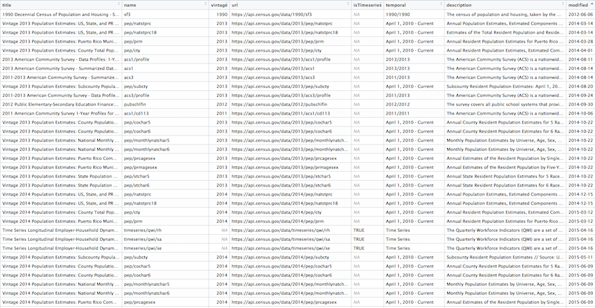
We won’t get too deep into the usage of censusapi, though I recommend the excellent documentation later.
We’ll focus on using the getCensus() function form the package. It makes an API call and returns a data frame of results.
These are the arguments you’ll need to pass it:
name- the name of the Census data set, like “acs5” or “timeseries/bds/firms”vintage- the year of the data setvars- one or more variables to access (remember B02001001 from above?)region- the geography level of data, like county or tracts or state
You can use listCensusMetadata() to see what tables might be available from the ACS Census survey.
The following lines of code using listCensusMetadata will take a very long time to load, so you can skip this step for now. Also, at the moment of this class this line of code won’t work unless you have the developer version.
# The lines below will make sure you have the developer version
# of censusapi so listCensusMetaData() will work correctly

install.packages("devtools")
devtools::install_github("hrecht/censusapi")

acs_vars <- listCensusMetadata(name="acs/acs5", type="variables", vintage=2016)

View(acs_vars)
It takes quite a few minutes to download the list of this data set (23,000 rows!) but once you get it, you can explore it to see what sort of data you might like to download. You can also refer to the Census for some guidance.
We’ll pull median income: B21004_001E
tx_income <- getCensus(name = "acs/acs5", vintage = 2016,
    vars = c("NAME", "B19013_001E", "B19013_001M"),
    region = "county:*", regionin = "state:48")
head(tx_income)
## state county NAME B19013_001E B19013_001M
## 1 48 001 Anderson County, Texas 42146 2539
## 2 48 003 Andrews County, Texas 70121 7053
## 3 48 005 Angelina County, Texas 44185 2107
## 4 48 007 Aransas County, Texas 44851 4261
## 5 48 009 Archer County, Texas 62407 5368
## 6 48 011 Armstrong County, Texas 65000 9415Alright, time to join it to our tx spatial data frame and map it.
# Can't join by NAME because tx_income data frame has "County, Texas" at the end
# We could gsub out the string but we'll join on where there's already a consistent variable, even though the names don't line up

tx4ever <- left_join(tx, tx_income, by=c("COUNTYFP"="county"))


ggplot(tx4ever) +
  geom_sf(aes(fill=B19013_001E), color="white") +
  theme_void() +
  theme(panel.grid.major = element_line(colour = 'transparent')) +
  scale_fill_distiller(palette="Oranges", direction=1, name="Median income") +
  labs(title="2016 Median income in Texas counties", caption="Source: US Census/ACS5 2016")
Download Census data and shapefiles together
The most recent package dealing with Census data is tidycensus and it brings together what we’ve done above– the data and the geography. It’s also created by Kyle Walker.
You can use it to pull data only like with censusapi or you can use it to pull shape files only, like with tigris.
But with tidycensus, you can download the shape files with the data you want already attached. No joins necessary.
I won’t get into the particulars of looking up geography types and Census variables.
Let’s get right into mapping. We’ll calculate unemployment percents by Census tract in Jersey City. It’ll involve wrangling some data. But querying the data with get_acs() will be easy and so will getting the shape file by simply passing it geometry=T.
# if you don't have tidycensus installed yet, uncomment and run the line below

#install.packages("tidycensus")
library(tidycensus)

# Pass it the census key you set up before
census_api_key("YOUR API KEY GOES HERE")## To install your API key for use in future sessions, run this function with `install = TRUE`.jobs <- c(labor_force = "B23025_005E",
unemployed = "B23025_002E")
jersey <- get_acs(geography="tract", year=2016, variables= jobs, county = "Hudson", state="NJ", geometry=T)
head(jersey)Time for some math. Can you follow what’s happening in the code based on what you’ve learned in previous chapters?
We can string the dplyr wrangling and ggplot2 code together. Just watch and look out for the transition from %>% to +.
library(tidyr)

jersey %>%
  mutate(variable=case_when(
    variable=="B23025_005" ~ "Unemployed",
    variable=="B23025_002" ~ "Workforce")) %>%
  select(-moe) %>%
  spread(variable, estimate) %>%
  mutate(percent_unemployed=round(Unemployed/Workforce*100,2)) %>%
ggplot(aes(fill=percent_unemployed)) +
  geom_sf(color="white") +
  theme_void() +
  theme(panel.grid.major = element_line(colour = 'transparent')) +
  scale_fill_distiller(palette="Reds", direction=1, name="Estimate") +
  labs(title="Percent unemployed in Jersey City", caption="Source: US Census/ACS5 2016") +
  NULL
Faceting maps
One more example.
We’ll pull the population of non-Hispanic whites, non-Hispanic blacks, non-Hispanic Asians, and Hispanics by Census tract for the 2010 Census. The function is get_decennial() and we’ll also add the summary_var argument to get multi-group denominators.
racevars <- c(White = "P0050003",
              Black = "P0050004",
              Asian = "P0050006",
              Hispanic = "P0040003")

harris <- get_decennial(geography = "tract", variables = racevars,
                  state = "TX", county = "Harris County", geometry = TRUE,
                  summary_var = "P0010001")

head(harris)
This is a very tidy data frame.
And looks like we’ve have some grouping material.
# If you dont have the viridis package installed yet, uncomment and run the line below
#install.packages("viridis")

library(viridis)

harris %>%
  mutate(pct = 100 * (value / summary_value)) %>%
  ggplot(aes(fill = pct, color = pct)) +
  facet_wrap(~variable) +
  geom_sf() +
  coord_sf(crs = 26915) +
  scale_fill_viridis(direction=-1) +
  scale_color_viridis(direction=-1) +
  theme_void() +
  theme(panel.grid.major = element_line(colour = 'transparent')) +
  labs(title="Racial geography of Harris County, Texas", caption="Source: US Census 2010")
Well, we’ve gone over a lot of mapping techniques that do pretty much the same thing.
But now you’ve got a grasp of all the options.
Pick which one works best for your case.
About Alaska and Hawaii
Oh yeah.
If you pass shift_geo=T to the get_acs() function in tidycensus then the states will be re positioned.
county_pov <- get_acs(geography = "county",
                      variables = "B17001_002",
                      summary_var = "B17001_001",
                      geometry = TRUE,
                      shift_geo = TRUE) %>%
  mutate(pctpov = 100 * (estimate/summary_est))

ggplot(county_pov) +
  geom_sf(aes(fill = pctpov), color=NA) +
  coord_sf(datum=NA) +
  labs(title = "Percent of population in poverty by county",
       subtitle = "Alaska and Hawaii are shifted and not to scale",
       caption = "Source: ACS 5-year, 2016",
       fill = "% in poverty") +
  scale_fill_viridis(direction=-1)
So, why not use tidycensus every time instead of tigris?
Well, you don’t need a Census key API to use tigris.
© Copyright 2018, Andrew Ba Tran