Charts with ggplot2
Let’s load some data, create a chart, and break down the layers.
We’ll some data from Vulture.com comparing ages of leading men in movies compared to their love interests.
library(readr)

ages <- read_csv("data/ages.csv")

head(ages)
## # A tibble: 6 x 7
## Movie Genre actor actor_age actress actress_age budget
## <chr> <chr> <chr> <int> <chr> <int> <dbl>
## 1 Mo' Better Blues drama Denzel … 35 Joie Lee 28 10
## 2 Malcolm X drama Denzel … 37 Angela … 34 34
## 3 The Preacher's Wife drama Denzel … 41 Whitney… 33 40
## 4 He Got Game drama Denzel … 43 Milla J… 22 25
## 5 Remember the Titans drama Denzel … 45 Micole … 29 30
## 6 Training Day drama Denzel … 46 Eva Men… 27 45This is the data we’re working with.
The variables/columns are Movie, Genre, actor, actor_age, actress, actress_age, budget.
Here’s the chart. Run this in your console.
# If you haven't installed the ggplot2 package yet, uncomment and run the line below
#install.packages("ggplot2")

library(ggplot2)

ggplot(data=ages) +
   geom_point(mapping=aes(x=actor_age, y=actress_age)) +
   expand_limits(x = 0, y = 0) +
geom_abline(intercept=0, col="light gray") 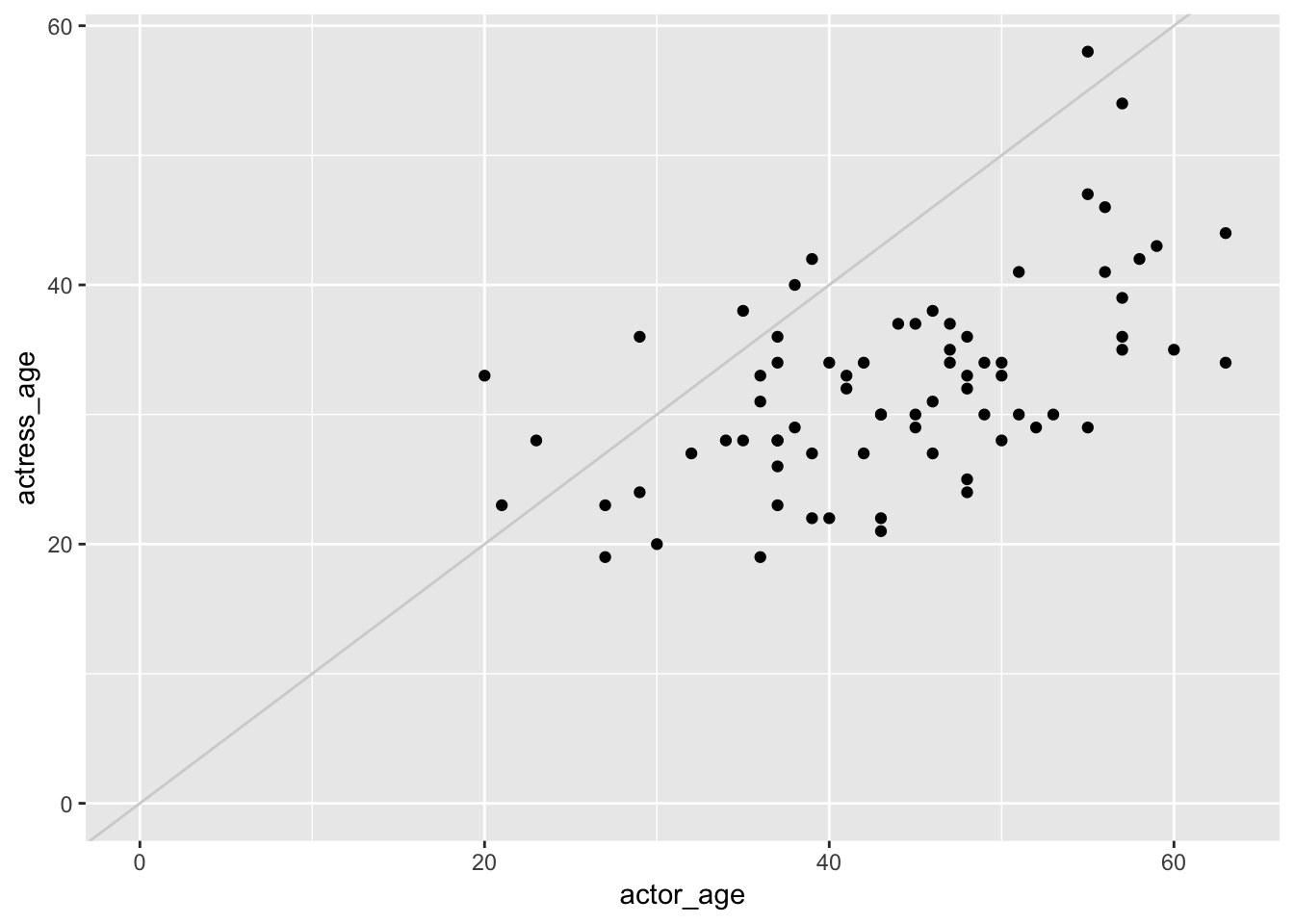
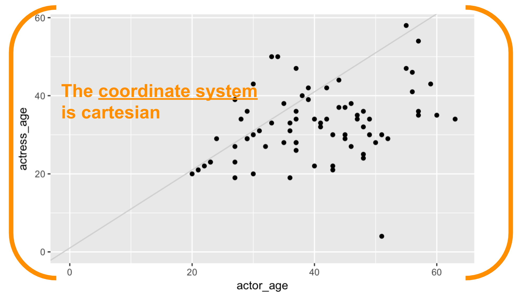
What’s this chart show? Men tend to be much older than women in movies.
Let’s break the components of this chart down.
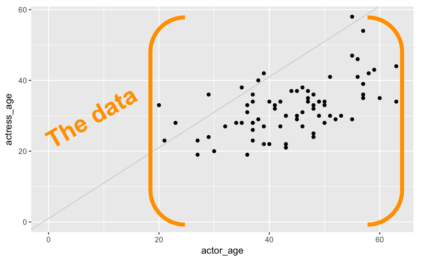
We start with with the data frame. We initialized the data viz function ggplot() by passing the ages data frame to it.

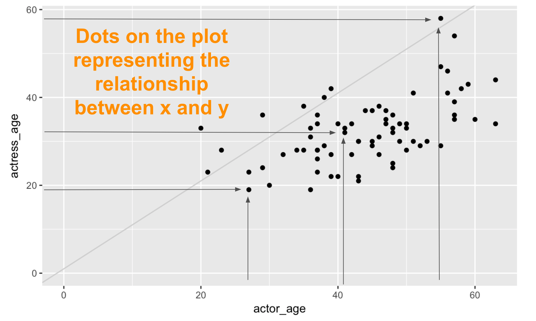
Next, we have the dots representing the data we chose to visualize on the x and y axes.
Mappings describe how aesthetics should relate to the variables in the data.

Set the aesthetics (aes()) visual characteristics that represent your data.
We are using the default geometric object and color but these are customizable:
- position
- size
- color
- shape
- transparency
- fill
For each aesthetic, we can set the scales for how visual characteristic is converted to display values. We’ll practice this later on.
Let’s take a look at the geom_ function we add to ggplot().
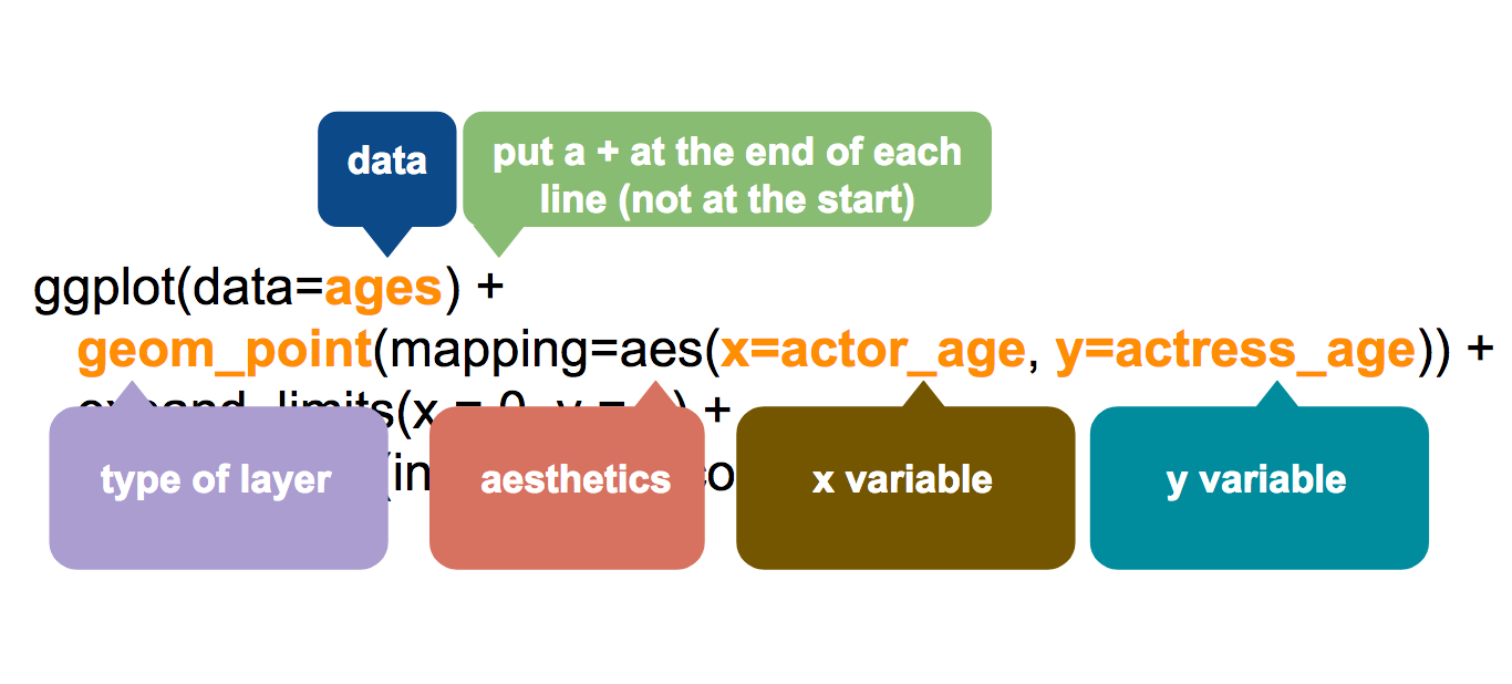
Notice that ggplot2 requires a plus between functions.
This package was created before dplyr and others that implemented the %>% piping.
It’s a weird quirk that I find myself messing up often since the shortcut for piping is pretty much muscle memory to me.
If you’re using ggplot: plus it!
For everything else: pipe it!
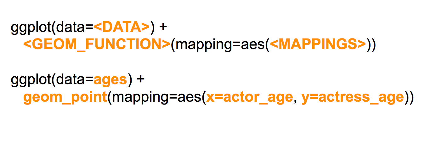
So geom_point() is merely one type out of dozens of possible geom_functions, like geom_bar() or geom_boxplot().
No matter the geom_function you end up with, it still requires mappings to be passed to it.
In this chart’s instance, it’s actor_age and actress_age from the ages data frame.
This is basically all you need to create a chart in R. The ggplot() and the data and the geom_ and mapping from aes(). You don’t have to run the other two lines below from our example.
But we added more instructions for clarity.

The next line refers to some scaling options.
Scaling can also be passed to the aes() of the geom_function but can also apply to the entire chart.
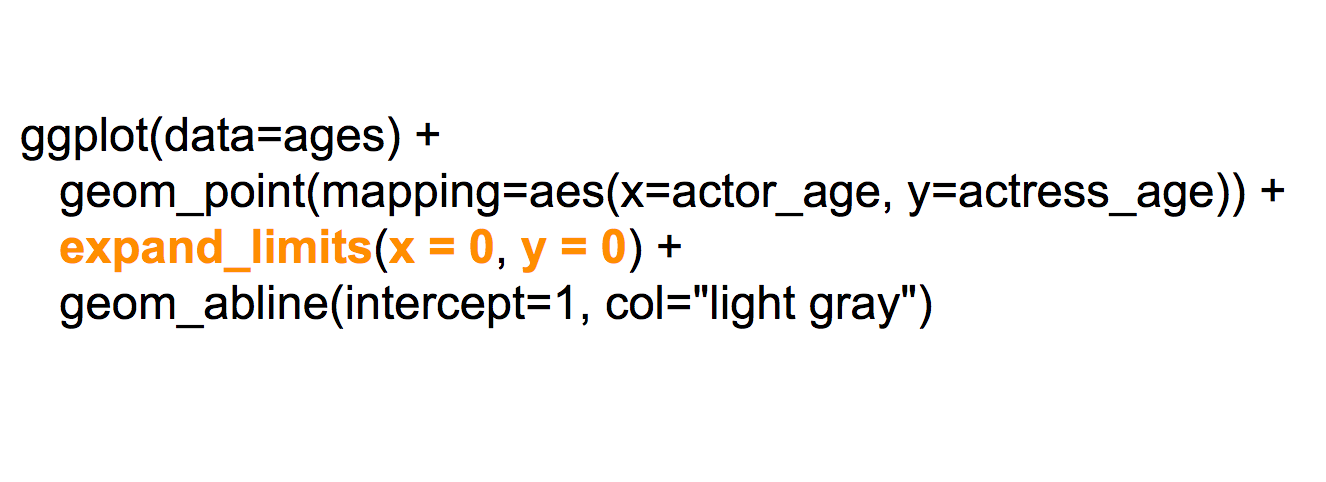 In this chart, we used the
 expand_limits() function to force the x- and y-axis to start at 0.
Otherwise, ggplot() would shift the scale so that the points in the chart fill up the entire chart. It assumes you don’t want that extraneous white space that doesn’t include data.
But for this particular data, we want to emphasize the disparity in ages by starting at the zeroes. Plus, there is a large contingent of data visualization pros that might yell at you for not starting the base at zero (even though there might be some exceptions to that rule!).
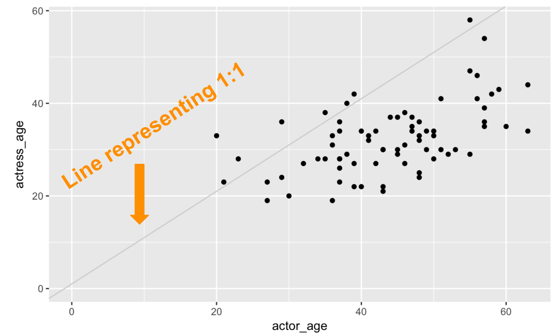
The last line in the stack of functions we have so far is the ab_line(). It’s not necessary, but it’s part of the layering options in ggplot2.

Each function in ggplot2 like geom_abline() allows for additional variables that can be passed to it. In this example, we specify the intercept should be at 1 and the color of the bar should be “light gray”. We accept the default width of the line by not passing it the variable to the geom_abline() at all.
Okay, let’s make some more charts.
But first, consider the data.
Data
It’s crucial to understand the structure of the data you have when working with ggplot2().
head(ages)## # A tibble: 6 x 7
## Movie Genre actor actor_age actress actress_age budget
## <chr> <chr> <chr> <int> <chr> <int> <dbl>
## 1 Mo' Better Blues drama Denzel … 35 Joie Lee 28 10
## 2 Malcolm X drama Denzel … 37 Angela … 34 34
## 3 The Preacher's Wife drama Denzel … 41 Whitney… 33 40
## 4 He Got Game drama Denzel … 43 Milla J… 22 25
## 5 Remember the Titans drama Denzel … 45 Micole … 29 30
## 6 Training Day drama Denzel … 46 Eva Men… 27 45We have six variables (columns) in this data frame.
Each row represents data for a single movie. That’s pretty tidy.
It seems like an obvious format, but not all data sets have this structure by default.
Recall the previous chapter when we were dealing with wide versus long data?
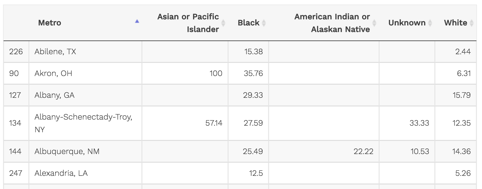
The variables for each race are spread out into columns.
This looks great in a spreadsheet but it doesn’t work well with ggplot2 because it isn’t tidy.
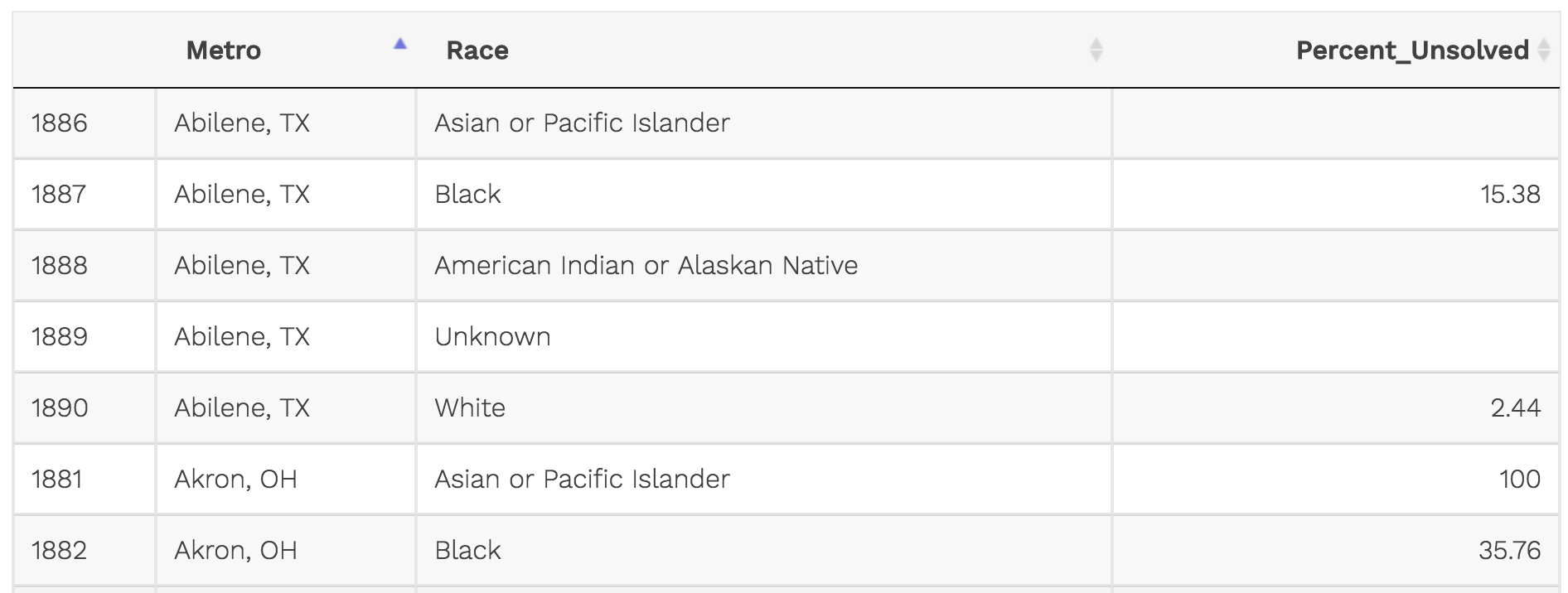
That’s better. Each row is a different variable. This way, we could add another variable for percent solved or total cases per metro and race.
It’s simply more versatile.
Data works best in ggplot() in a tidy, long (tall) format.
Geoms
Let’s go over some new geom_ types.
Simple bar plot
We’ll start with geom_bar() which is the most common type of chart you’ll need to make starting out.
Notice that we are nesting aes() into ggplot() this time and not using the method= or the data= because they are not necessary.
ggplot(ages,
    aes(x=actor)) +
    geom_bar()
Start keeping track of how many variables we’re using in each of these charts.
For the one above, we started with one variable and sort of created a new one by counting the instances they appear in the data frame. We didn’t have to alter the data frame at all or summarize it for this chart to work.
Common geom_bar() options:
- width
- fill
- color (border)
- position_dodge()
Stacked bar plot
ggplot(data=ages,
  aes(x=actor, fill=Genre)) +
  geom_bar()
Aesthetics
Before we move on to other chart types, let’s talk about what just happened in the chart above.
The only difference between the bar plot and the stacked bar plot was that , fill=Genre was added to the aes() function.
Variable count: 2 (actor & genre, if you don’t count the count of actor)
Here’s a reminder that these are the aesthetic properties that can be set:
- position
- size
- color
- shape
- transparency
- fill
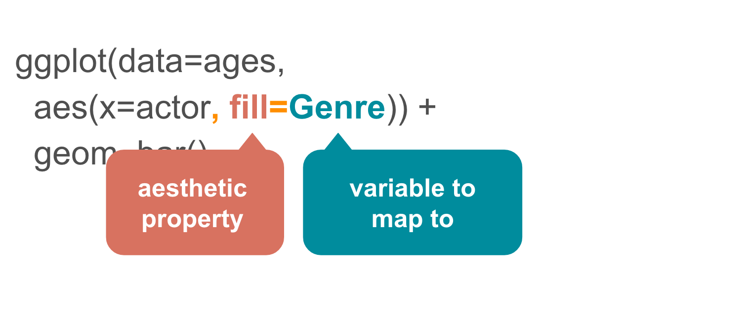
What if we changed the aes() from fill to color?
ggplot(data=ages,
  aes(x=actor, color=Genre)) +
  geom_bar()
Yikes, not as effective. But now you know about the option.
When would this be a good option? Line charts or dots.
Notice how the color and legend was added automatically?
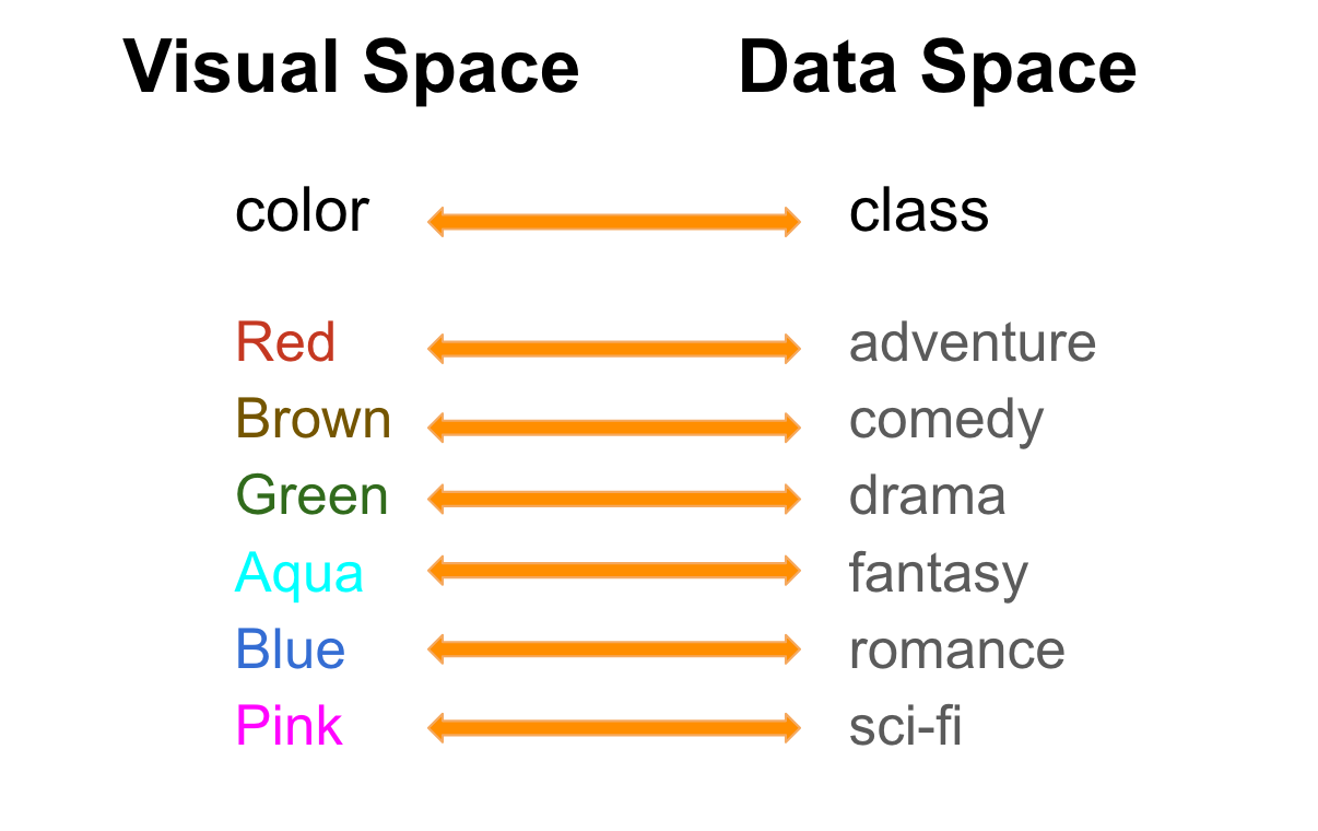 This is the default color list. There are ways to customize the colors, but we’ll go over that in the next section.
Let’s go back to fill=Genre but this time with a twist.
Take a look at the code and see if you can spot why it didn’t work like it did earlier.
ggplot(data=ages,
  aes(x=actor), fill=Genre) +
  geom_bar()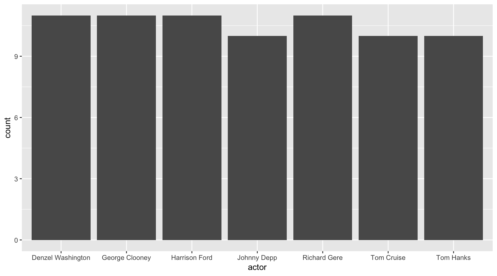
Do you see it?
It’s the parenthesis in aes() – it closed off before including fill=Genre so it wasn’t included. Try it this time correctly.
ggplot(data=ages,
  aes(x=actor, fill=Genre)) +
  geom_bar()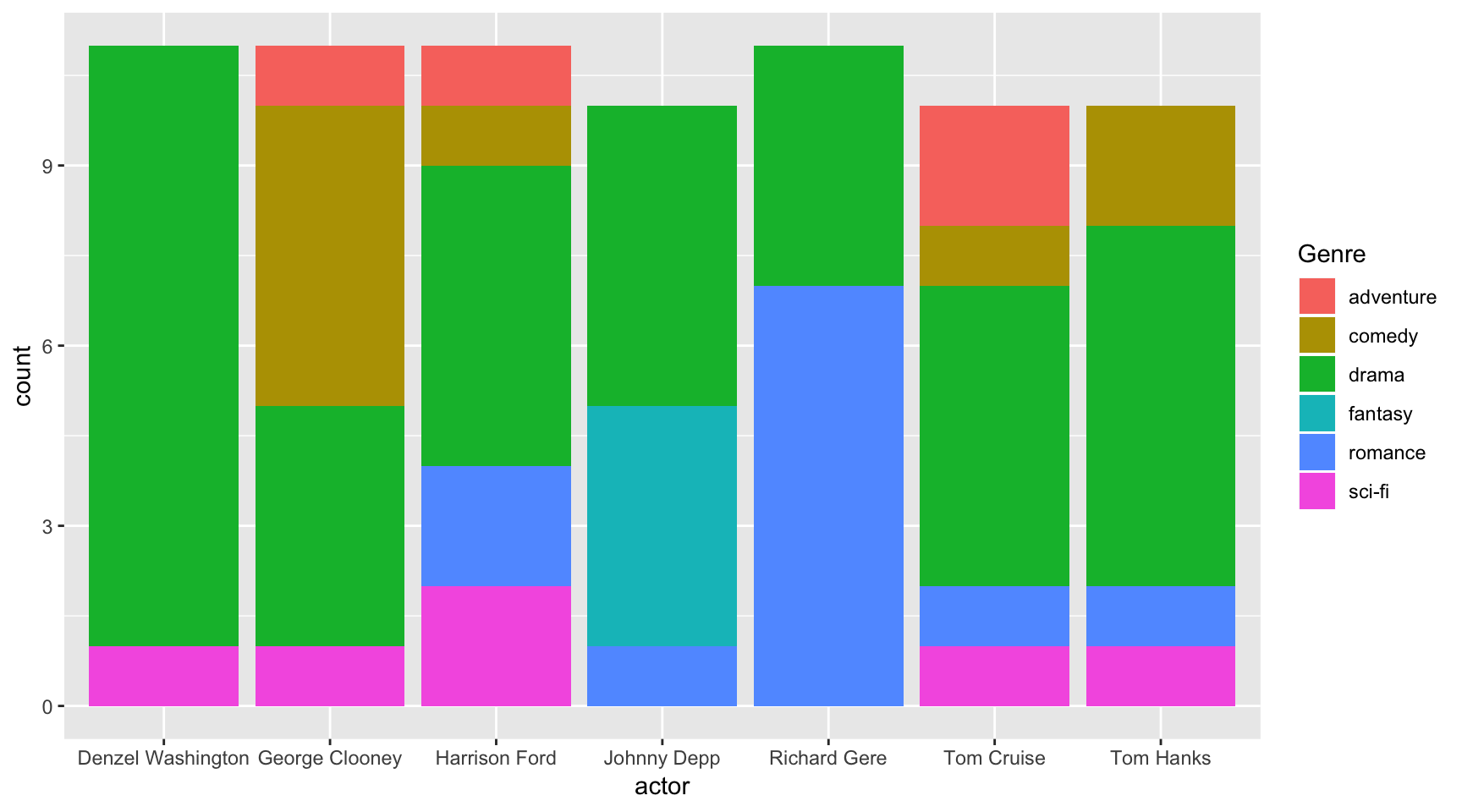
Grouped bar plot
ggplot(data=ages,
  aes(x=actor, fill=Genre)) +
  geom_bar(position="dodge")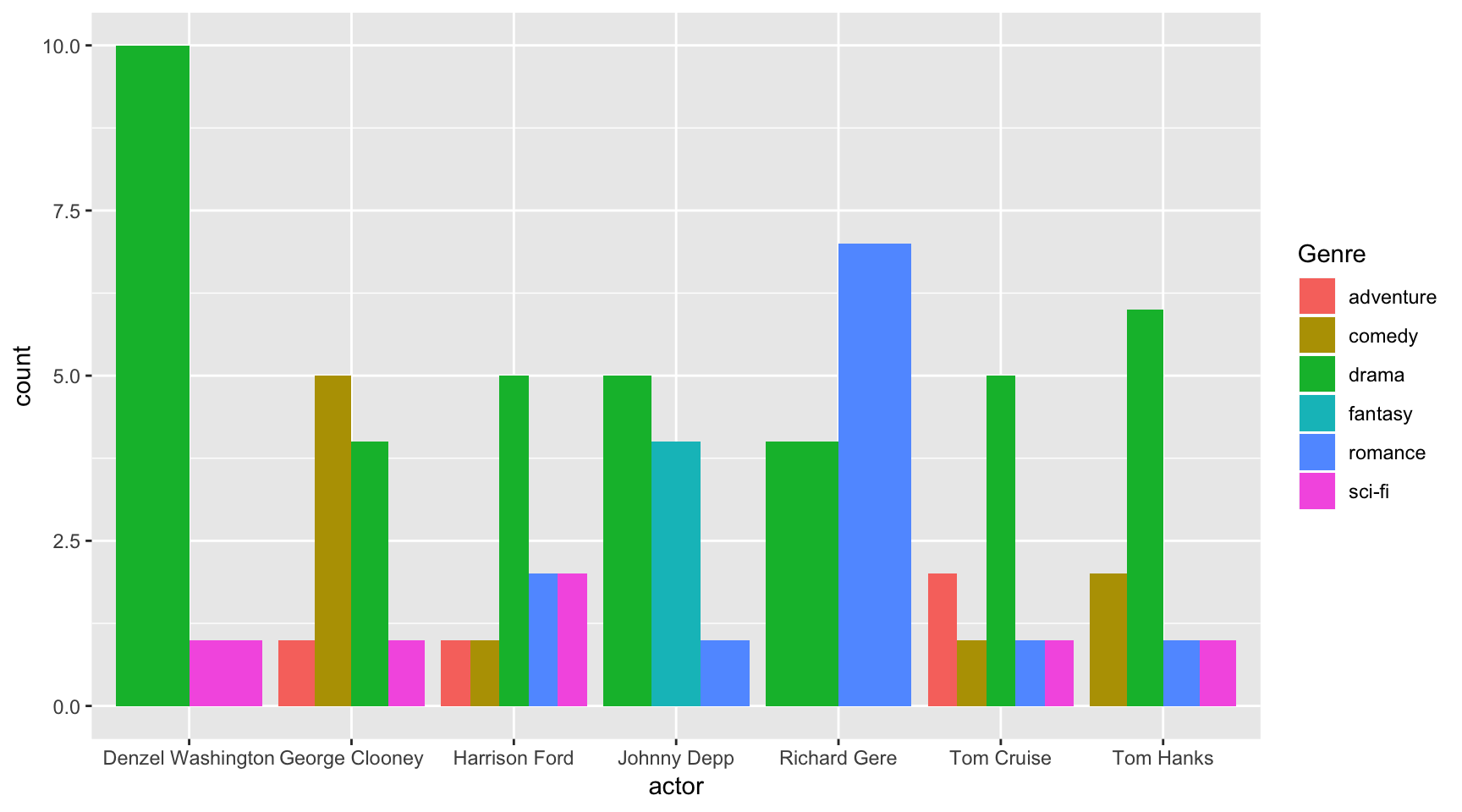
So this chart was similar to the stacked bar plot above, but this time position="dodge" was passed to the geom_bar() function.
This tells ggplot to group the bar plot.
This is useful for easier comparison within groups.
Spinogram
It’s simple to turn a stacked bar plot into a percent-based chart.
ggplot(data=ages,
  aes(x=actor, fill=Genre)) +
  geom_bar(position="fill")
This type of chart allows for a greater understanding of the proportion compared to other groups.
Box plot
You’ll see this type of chart often in research papers.
It succinctly summarizes the distribution of numbers in each category we’ve set: actors.
ggplot(ages, aes(x=actor, y=actress_age)) +
  geom_boxplot()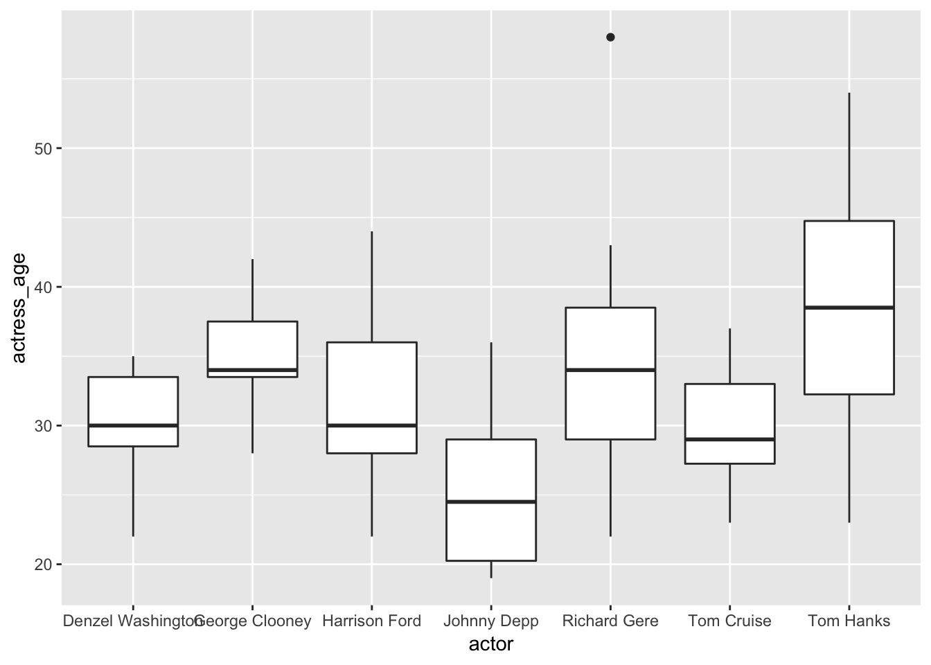
The height of the line is the max and min of the numbers in the y axis: actress ages.
The top of the box is the top quartile and the bottom of the box is the bottom quartile. The line in the middle is the median age. That floating dot? Considered an outlier.
Common geom_boxplot() options:
- fill
- color
- notch (=TRUE or FALSE)
- outlier. color shape size
Violin plot
This is another way to show distribution of numbers.
ggplot(ages, aes(x=actor, y=actress_age)) +
  geom_violin()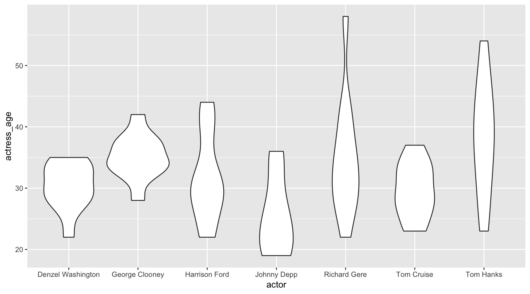
The wider the diameter, the more numbers there are. It’s a bit more intuitive to follow.
Variable count: 2 - actress_age and actor
Scaling
Useful to transform or rescale the data with.
geom_histogram
ggplot(data=ages, aes(x=actor_age)) +
  geom_histogram(binwidth=1)
Common geom_histogram() options:
- binwidth
- color (border)
- fill
Applying a logorithmic scale
It makes more sense to apply scalar transformations to while plotting rather than altering the data set itself.
ggplot(data=ages, aes(x=actor_age)) +
  geom_histogram() + scale_x_log10()
## `stat_bin()` using `bins = 30`. Pick better value with `binwidth`.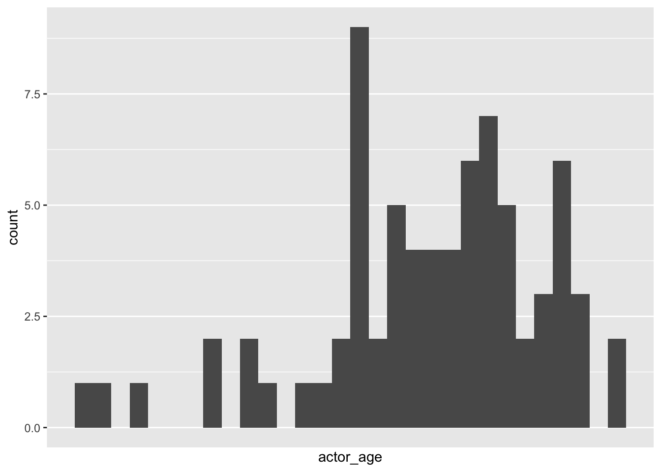
Kernel density plot
ggplot(data=ages,
aes(x=actress_age)) +
geom_density(fill="red")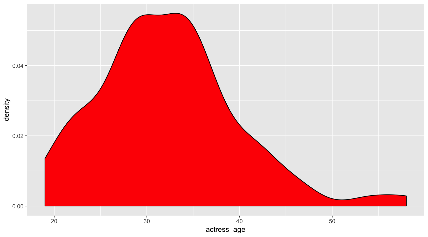 Common
 geom_density() options:
- fill
- color
- alpha
ggplot(data=ages,
  aes(x=actress_age, fill=actor)) +
  geom_density(alpha=.3)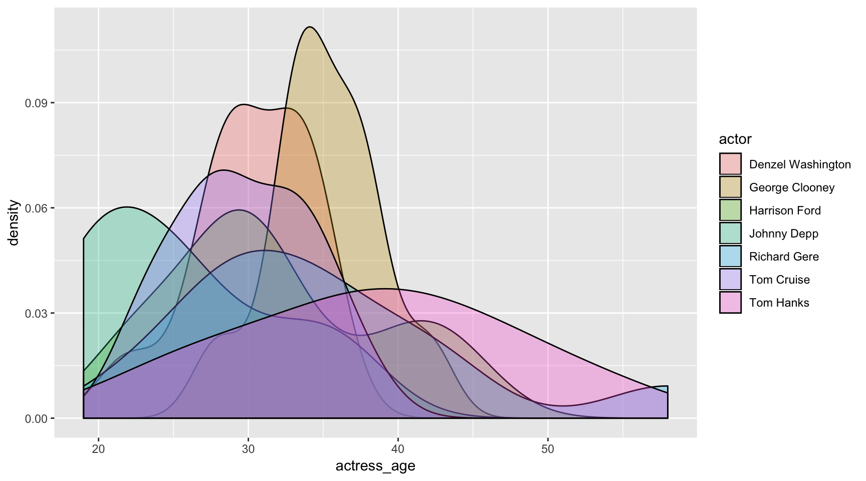
Dot plot
ggplot(ages,
       aes(x=actress_age, y=Movie)) +
  geom_point()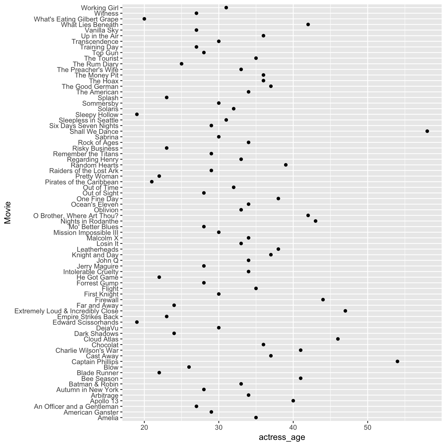
Line plot
Let’s start by summarizing the ages of the actresses per actor.
library(dplyr)

avg_age <- ages %>%
  group_by(actor) %>%
  mutate(age_diff = actor_age-actress_age) %>%
  summarize(average_age_diff = mean(age_diff))

ggplot(avg_age, aes(x=actor, y=average_age_diff, group=1)) +
  geom_line()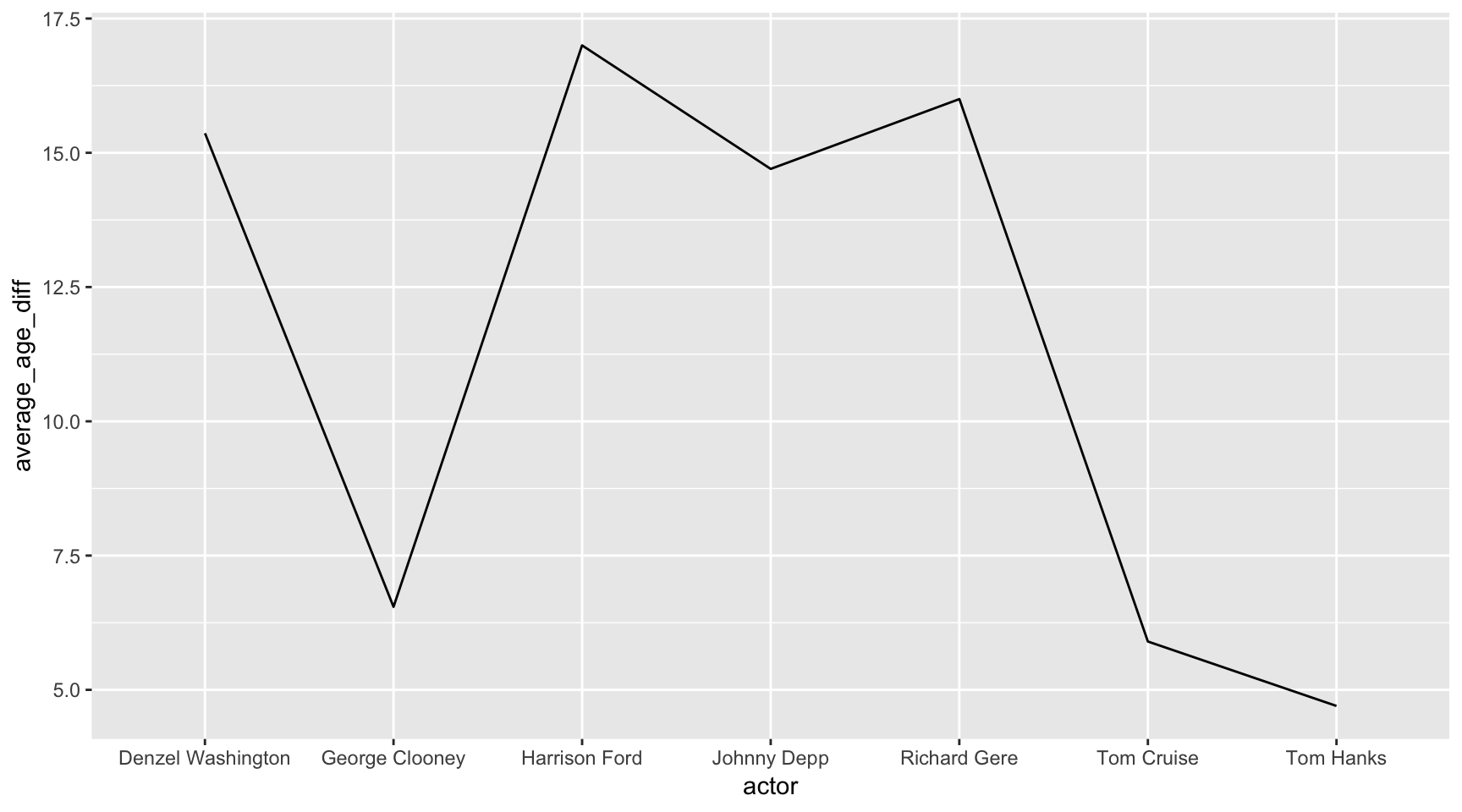
Variable count: 2 - the new mutated variable average_age_diff and actor
Don’t forget, we can add more layers.
Let’s make the same chart above but with dots, too.
ggplot(avg_age, aes(x=actor, y=average_age_diff, group=1)) +
  geom_line() +
  geom_point()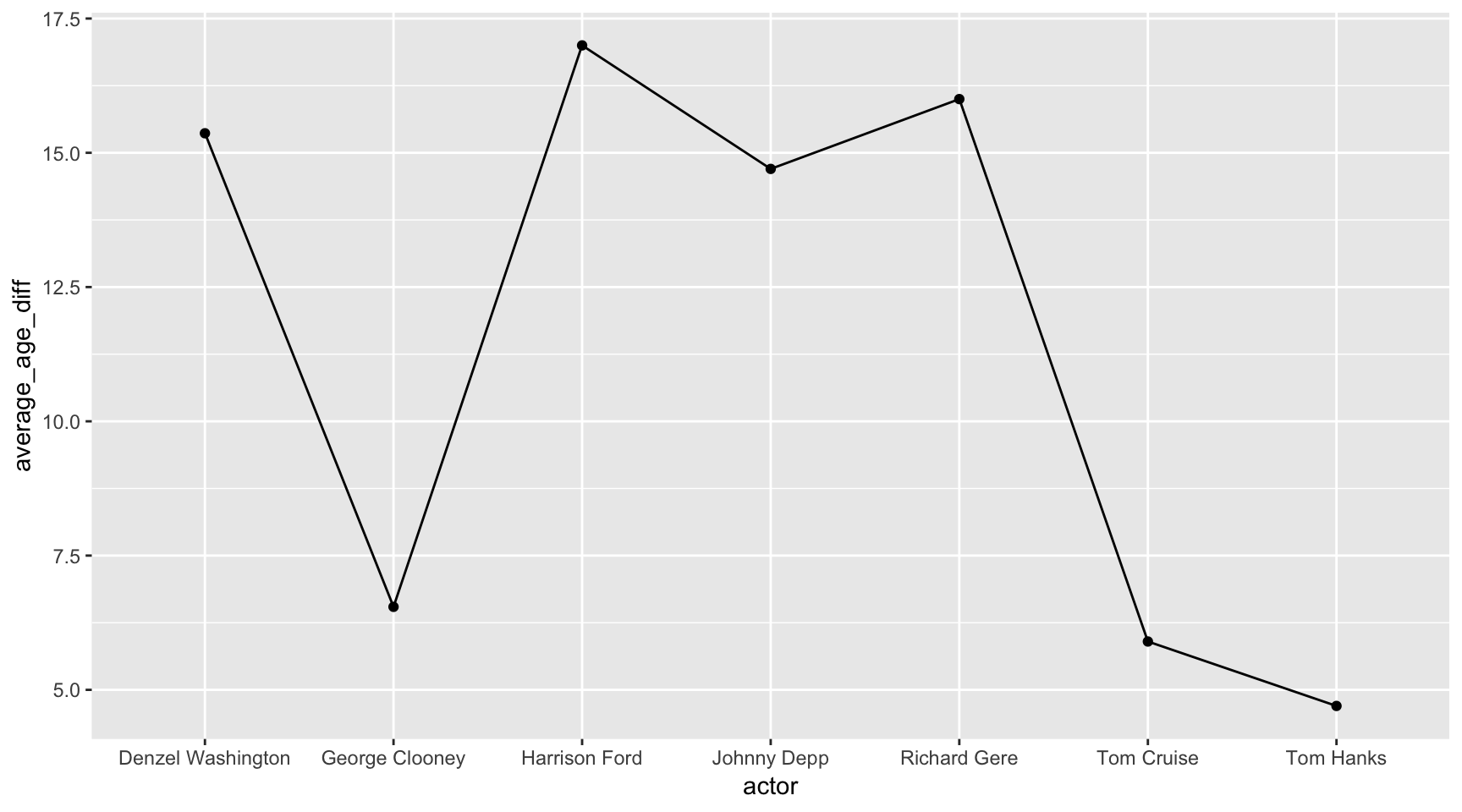
Does this make sense as a visualization? Mmm… nah.
Never use a line chart to chart anything across an axis that doesn’t represent something continuous.
Common geom_point() options:
- color
- fill
- alpha
- shape
- size
Scatterplot with fit
We’ve made a scatter plot before.
This time, let’s add a geom_smooth() layer.
ggplot(ages,
      aes(x=actor_age,
          y=actress_age)) +
  geom_point() +
  geom_smooth()
## `geom_smooth()` using method = 'loess' and formula 'y ~ x'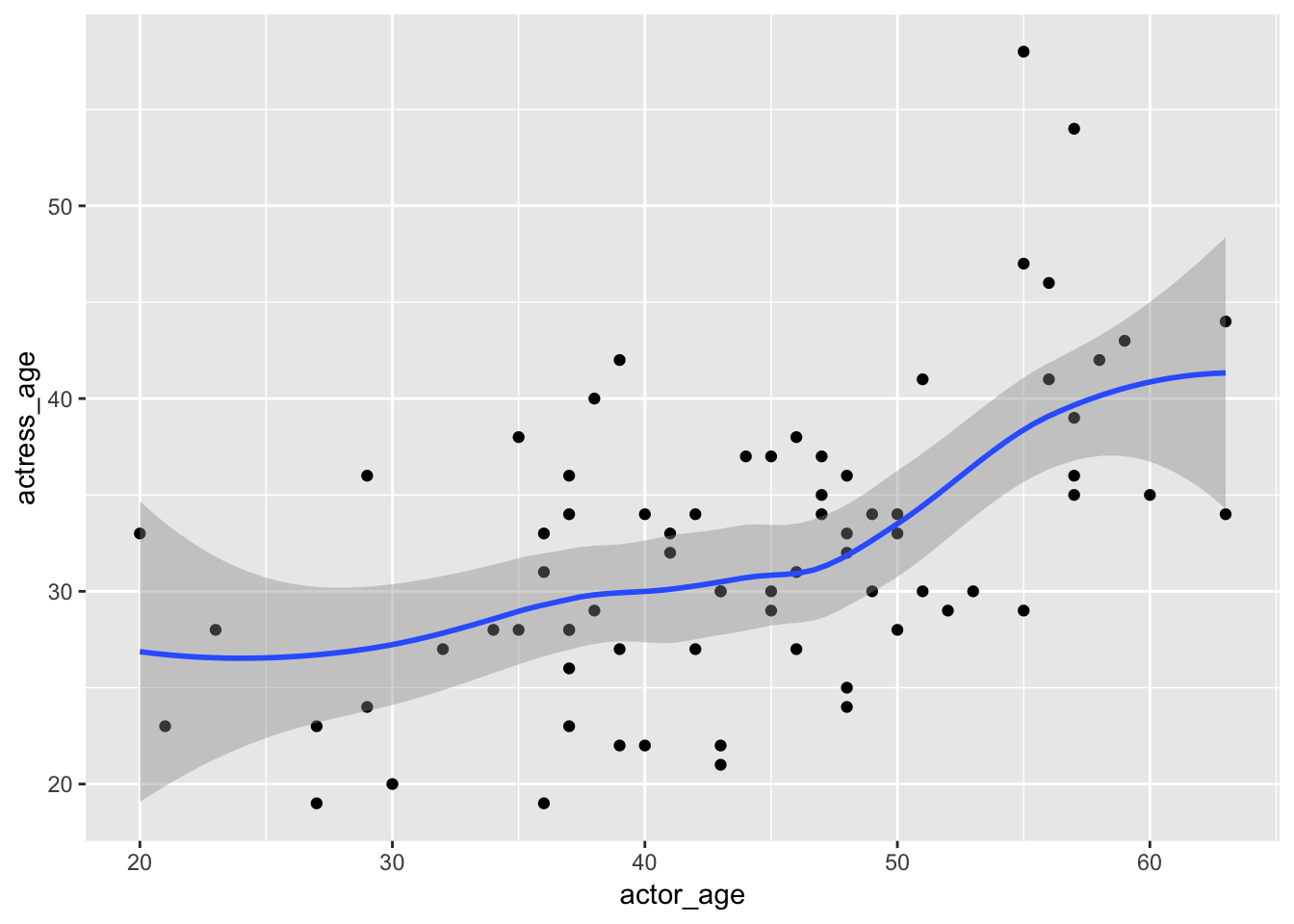
We can customize it and throw in a linear regression line. Notice the ~ which is used often in statistical analysis formulas.
ggplot(ages,
      aes(x=actor_age,
          y=actress_age)) +
  geom_point() +
  geom_smooth(method="lm",
              formula=y~x)
Grouping
ggplot(data=ages,
       aes(x=actor_age,
           y=actress_age,
           color=actor)) +
  geom_point()
Variable count: 3! We’re working with actor_age, actress_age, and actor.
See how we’re able to start packing more information into a chart with a line of code?
When you’re exploring data visually, this might help surface insights you wouldn’t notice by just looking at the raw data.
Everything’s still pretty clustered in this chart so you might only be able to notice outliers like Tom Cruise and Johnny Depp on the bottom left. But everything in the middle is kinda just too much.
Let’s go crazy and add another variable.
ggplot(data=ages,
       aes(x=actor_age,
           y=actress_age,
           color=actor,
           shape=Genre)) +
  geom_point()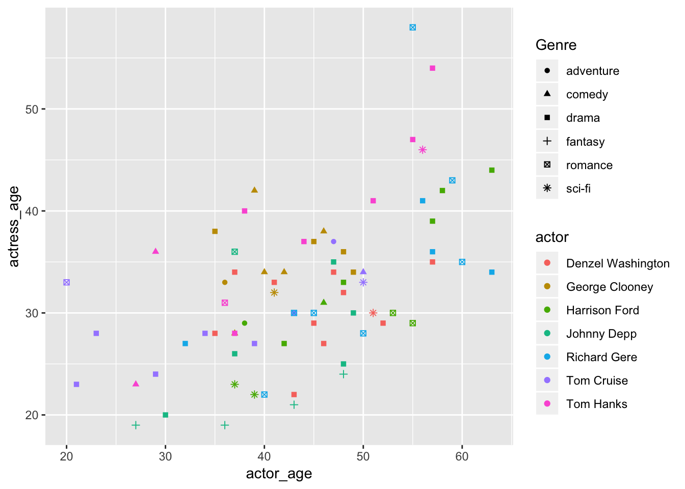
Variable count: 4! We’re working with actor_age, actress_age, actor, and now Genre.
This looks not good.
Why did we do this?? I just wanted to show you that the shapes option exist. You’ll probably never use it.
Okay, what if we try keeping the color and shapes to one variable: actor?
ggplot(data=ages,
       aes(x=actor_age,
           y=actress_age,
           color=actor,
           shape=actor)) +
  geom_point()
## Warning: The shape palette can deal with a maximum of 6 discrete values
## because more than 6 becomes difficult to discriminate; you have 7.
## Consider specifying shapes manually if you must have them.## Warning: Removed 10 rows containing missing values (geom_point).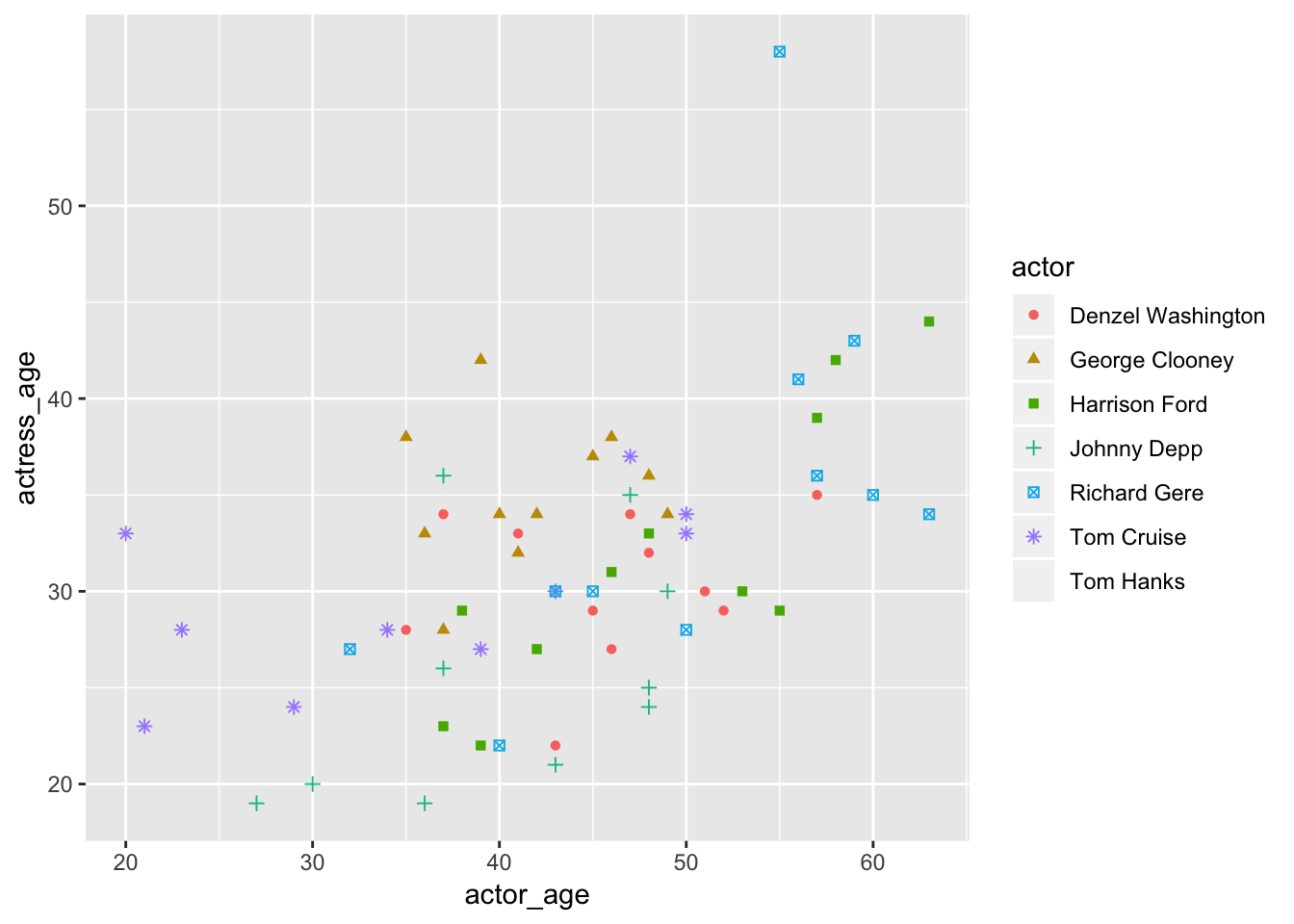
Nope, still not great. Plus, there are only a limited amount of shapes to pull from.
Did you see that warning?
## Warning: Removed 10 rows containing missing values (geom_point).That’s because it couldn’t find a shape for Tom Hanks. Hanks was left off the chart.
Don’t you feel horrible? Tom Hanks is the nicest guy ever.
Like colors, you should limit the palette so it doesn’t confuse readers.
Scatterplot with color and size
Let’s swap out Genre for another variable that might make more sense to add to the visualization: budget.
ggplot(data=ages,
       aes(x=actor_age,
           y=actress_age,
           color=actor,
           size=budget)) +
  geom_point()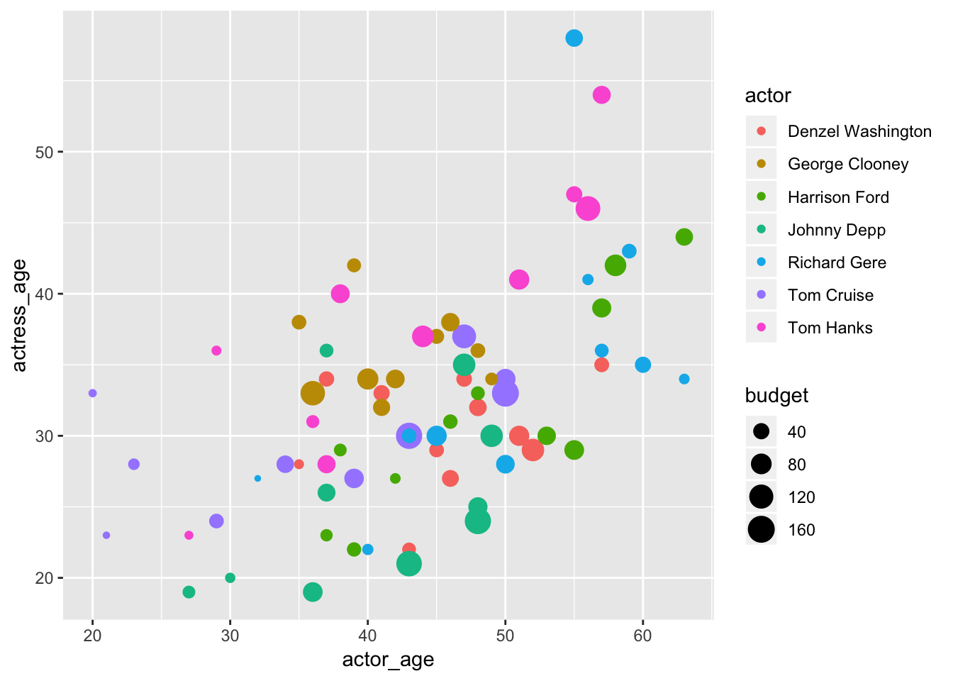
Variable count: 4! We’re working with actor_age, actress_age, actor, and now Genre.
Lots of data being communicated to readers here. The legends were auto-generated.
Coords
You’ll see stats in the geom_bar() function. This is the statistical transformations that summarize data. In this instance we’re setting it to "identity" because we want the bars to represent the numbers in the y in aes(), not the count of it.
- counts
- means
- trend lines
We’re going to alter the coordinates of the chart so that we get a horizontal chart instead of the default vertical one.
The coord_flip() option flips a chart you’ve been working on from vertical to horizontal or horizontal to vertical.
ggplot(data = avg_age, aes(x= actor, y=average_age_diff)) +
    geom_bar(stat="identity") +
    coord_flip()
Facets
Remember how that big scatter plot above had all the different colors on one viz and it was all clustered together?
It’s simple to break those out into individual charts.
This is sometimes referred to as “small multiples”.
ggplot(data=ages) +
   geom_point(mapping=aes(x=actor_age, y=actress_age)) +
   expand_limits(x = 0, y = 0) +
   geom_abline(intercept=0, col="light gray") +
   facet_grid(Genre~actor)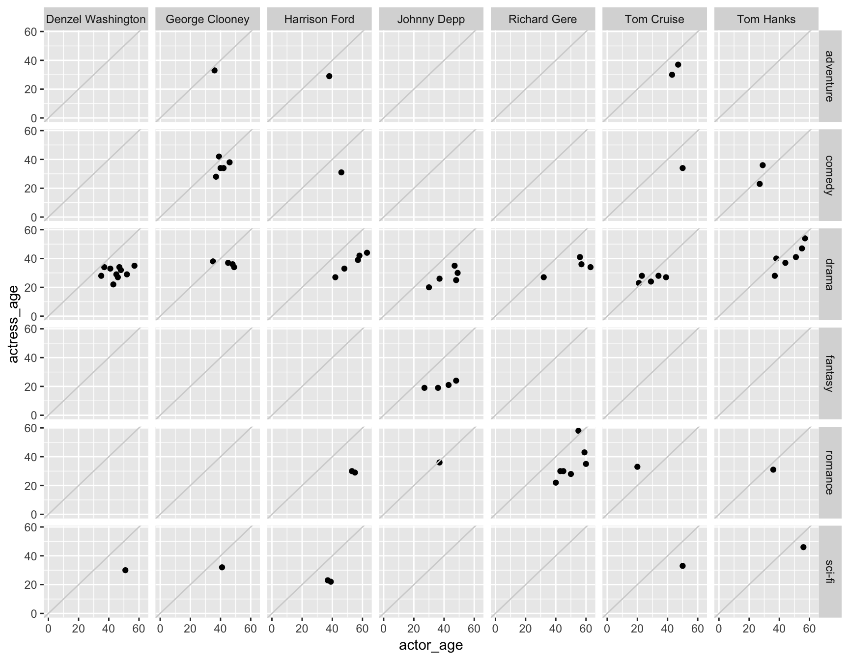
Variable count: 4! - We’re working with actor_age, actress_age, actor, and also Genre.
Take a moment to appreciate how easy this was. This is a pain in the ass in other languages, like D3.
Want to add another variable? Let’s do it. Add size=budget the geom_point().
ggplot(data=ages) +
   geom_point(mapping=aes(x=actor_age, y=actress_age, size=budget)) +
   expand_limits(x = 0, y = 0) +
   geom_abline(intercept=0, col="light gray") +
   facet_grid(Genre~actor)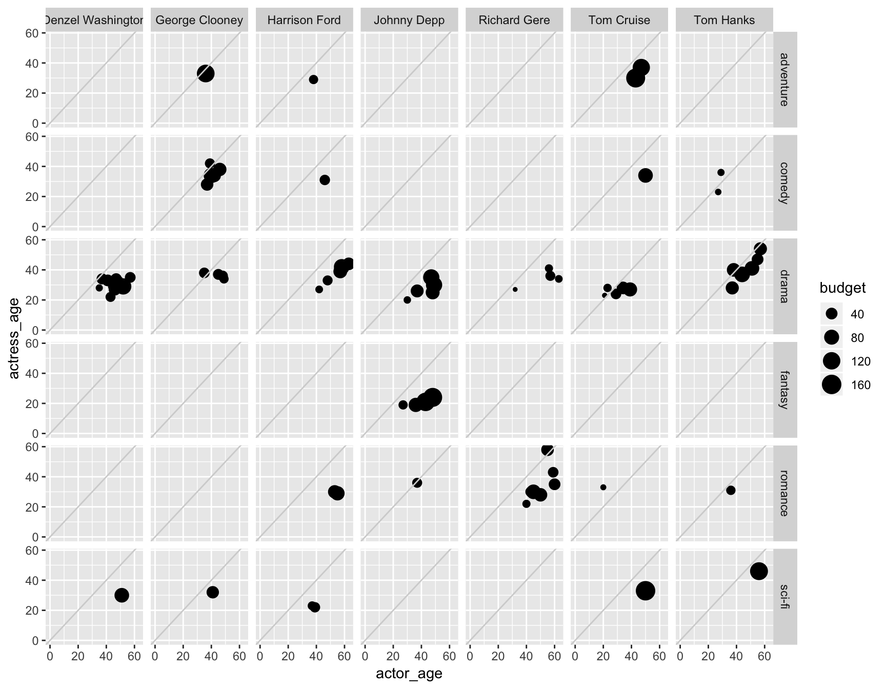
Variable count: 5! - We’re working with actor_age, actress_age, actor, and also Genre AND budget. The sizing kinda jumbles up the circles in some, but keep playing around with alpha or change the size of the chart, maybe. You can see it’s quite easy to play around with the options until you find the right balance.
This is all possible thanks to the tidiness of the data structure.
The variables might contain more than one group but it’s all tied back to rows with each individual movie.
Here are other types of ways to create “small multiples” through facets.
facets_grid(genre~actor)facets_grid(. ~ actor)- just columnsfacets_grid(actor ~ .)- just rowsfacets_wrap(~ var, ncol=#)- one classification variable wrapped to fill page
ggplot(data=ages) +
   geom_point(mapping=aes(x=actor_age, y=actress_age)) +
   expand_limits(x = 0, y = 0) +
   geom_abline(intercept=0, col="light gray") +
   facet_grid(.~actor)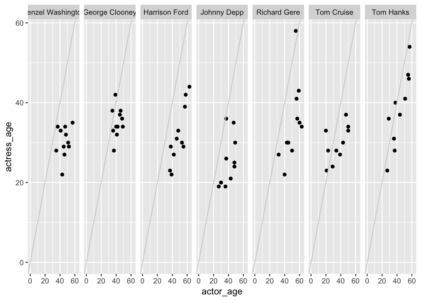
You don’t have to use two variables in facet_grid() – you can just use one and it’ll break out the charts based on where the ~ is in relation to the variable and the ..
The chart above had facet_wrap(.~actor) so the grid is split vertically.
If it was swapped to facet_wrap(actor~.) then the grid will split by row.
ggplot(data=ages) +
   geom_point(mapping=aes(x=actor_age, y=actress_age)) +
   expand_limits(x = 0, y = 0) +
   geom_abline(intercept=0, col="light gray") +
   facet_grid(actor~.)
I find myself using facet_wrap() more often because I can customize the number of columns in the small multiples with ncol=.
ggplot(data=ages) +
   geom_point(mapping=aes(x=actor_age, y=actress_age)) +
   expand_limits(x = 0, y = 0) +
   geom_abline(intercept=0, col="light gray") +
   facet_wrap(~actor, ncol=4)
Global versus Local
The layers in your ggplot() chart can be customized in nuanced ways.
Everything nested in the initial ggplot() call will be considered global and apply to the rest of the layers.
ggplot(ages,
      aes(x=actor_age,
          y=actress_age)) +
      geom_point()
So in the chart above, aes() with actor_age and actress_age are in the x and y globally.
But I can also pass aes() to the geom_point() layer, which will make that local and apply to that layer only.
ggplot(ages,
      aes(x=actor_age,
          y=actress_age)) +
      geom_point(aes(color=actor))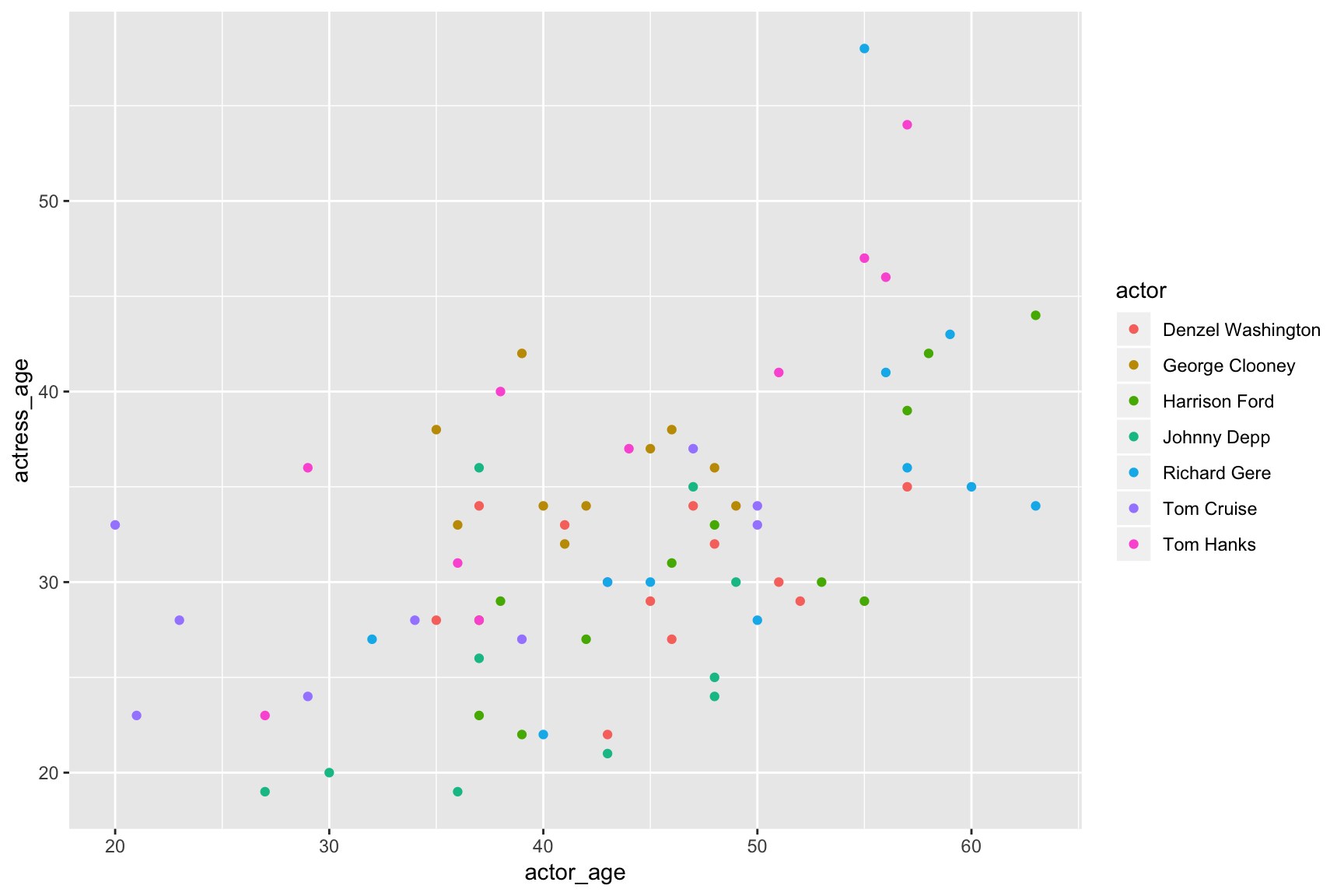
You can also set data locally.
This is very useful if you want to highlight a specific subset from the data.
# Let's make a copy of the  minus the actor variable so it can't be faceted

ages_copy <- ages %>% select(-actor)

ggplot(data=ages,
      aes(x=actor_age,
          y=actress_age,
          color=actor)) +
      geom_point(data=ages_copy, color="grey") +
      geom_point() +
      facet_wrap(~actor) +
      theme(legend.position="none") # This removes the legend
We were able to use different data sets. Globally, we wanted to use the ages data frame because we were going to facet it.
We needed a second data set without the actor variable to plot in a background layer and set the color manually to “grey” (go back to the code above and this time put color="grey" in aes() and see the difference). This was the first geom_point() layer referenced locally.
The second geom_point() built a scatter plot based on the global data set in ggplot().
This type of chart really improves on that first grouped scatter plot because it makes it easier to see each individual group in the context to the rest of the data.
Your turn
Challenge yourself with these exercises so you’ll retain the knowledge of this section.
Instructions on how to run the exercise app are on the intro page to this section.
Next steps
With some practice and understanding of basic geom-types you can quickly iterate through different ways to visualize your data.
Once your data is structured correctly, you can use ggplot2 to slice, group, and facet data visually multiple ways until you find something worth elaborating on.
What is being communicated? What information is left out or obscured?
Going through these examples, you saw how shapes, layout, the number of variables, etc, all matter. Swapping out geoms and aesthetics. Different combinations communicated better than others. It all depends on the structure of the data and what it contains.
By visualizing data with the grammar of graphics, you’ll approach data in a flexible new way.
Great, now let’s do more with charts including how to move beyond exploring the data visually and how to turn get these charts to publication quality.
© Copyright 2018, Andrew Ba Tran