Chapter 4
Visualizing data
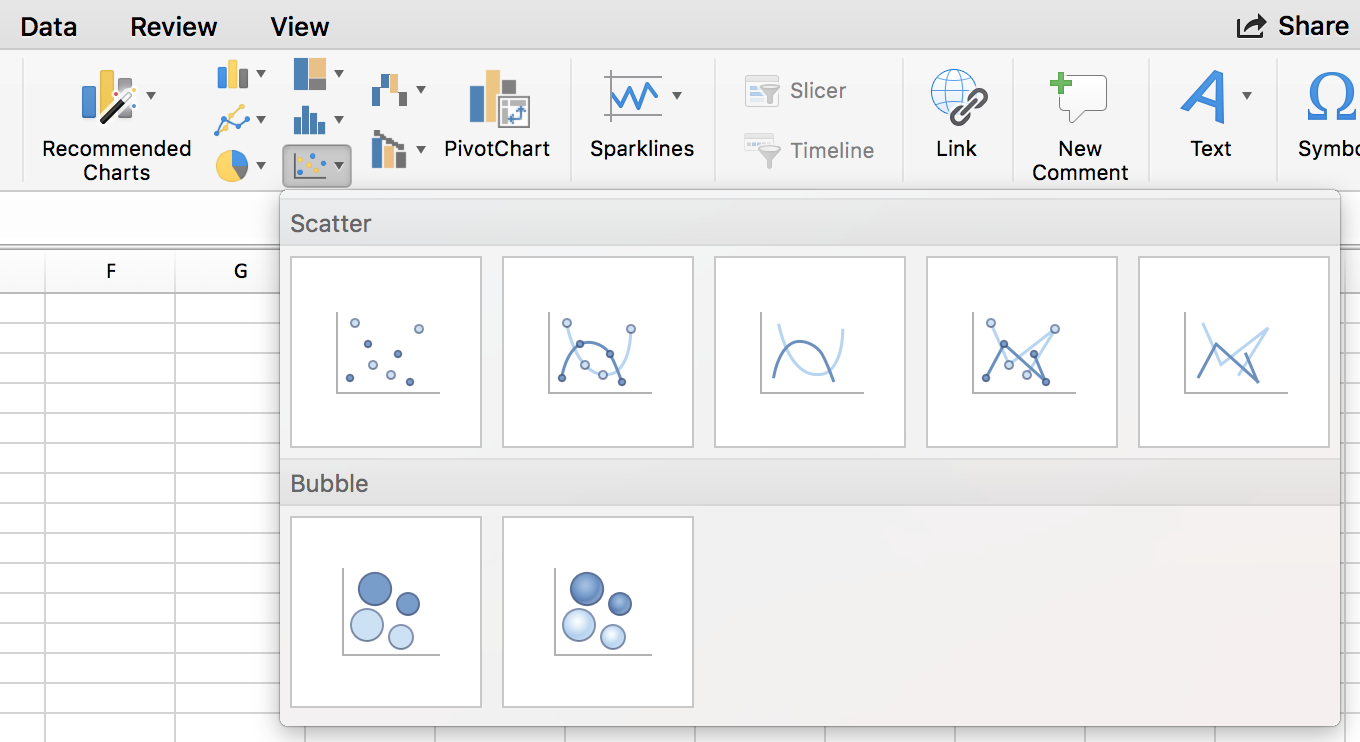
You’ve seen the typology of graph types in apps like Excel, right?

It’s a pretty good menu. Would you like a bar chart, a pie chart, a line chart, or any of these other options?
There’s no deep structure or explanation of how to get the data there– it only focuses on the end result.
This type of menu assumes you have data structured correctly to make that visualization work. But we rarely get the data we need in the format we need it to be in order to make the visualization immediately.
When you get raw data, you should be able think about all the transformations, summaries, and wrangling that can lead to good visualizations.
And sometimes you won’t know what works until you see it sketched out.
R allows you to quickly iterate through data visualizations to explore the data and see what works best to communicate what’s important to readers.
Hopefully by the end of this chapter, you’ll learn how to approach creating data visualizations differently. Instead of working toward a set end result or template, you start with the data set and explore where the structure takes you. You’ll be able to see the underlying connections between different graphs.
–
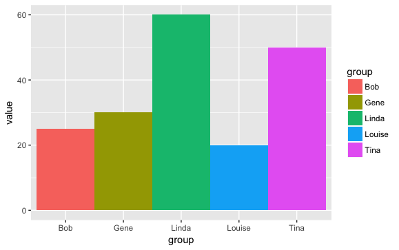
For example, consider these three charts that display the same data.

The pie chart focuses the reader on large percentages, and encourages the reader to think of the total (here, the amount represents the amount of time the Belcher family is out in the front of their restaurant) as distributed to different groups.

The stacked bar plot provides the same information, but makes it easier to accurately determine at a glance how large each group is out of the whole.

This bar chart splits the categories horizontally, and draws attention to how the family members are ordered. It encourages the reader to think about the distribution rather than disconnected categories, and gives a better sense of sense of scale.
Grammar of Graphics
The grammar of graphics lets you approach visualizations structurally, letting you combine and swap out graphical elements into figures that display data meaningfully.
It’s grown in popularity and has been implemented across many languages, like JavaScript, Julia, and Python. R’s version is ggplot2, created by Hadley Wickham and currently maintained by dozens from the R community.
If you look at the pie chart through the lens of the grammar of graphics, you can see that its pretty much a stacked bar chart, with the height mapped to the slice angle.
Once you can see that, you might consider options like mapping the bar height to the radius and give divide up the angles among the family members to create a radial plot. Or maybe add another variable into the mix and make a scatter plot?
These options might all turn out to be horrible, but at least you’ve cycled through them and thought about how data might be visualized.
Goals
- Charts with ggplot2
- Customizing charts
- More charts
Applying the grammar of graphics to data visualizations
Learning how to style and export ggplot2 charts
Playing around with ggplot2 extensions
Files and folders
The repo for this class is on GitHub, but can be easily downloaded to your desktop with the following commands:
install.packages("usethis")

usethis::use_course("https://github.com/r-journalism/learn-chapter-4/archive/master.zip")
Readings
ggplot2 resources
- Using ProPublica’s “statefaces” in ggplot2 - hrbrmstr
- ggplot2 cheatsheet - RStudio
- From Data to Viz - data-to-viz
ggplot2 examples * ggplot2 as a creativity engine and other ways R is transforming quantitative journalism - Financial Times * Gender gap: Three things we’ve learnt - BBC * The complete history of ever No. 1 tennis player in the world - SWI | GH * Huge increase in arrests of homeless in L.A - but mostly for minor offenses - LAT | GH * What I use to visualize data - FlowingData
Test yourself
There are links to exercise what you’ve learned spread through out this section.
It’s possible to run these files locally to test yourself if you’ve downloaded the files for the chapter as instructed above.
Make sure your project directory is correct and then run these lines in the console:
install.packages("learnr")
install.packages("rmarkdown")
install.packages("tidyverse")
install.packages("ggrepel")
install.packages("wesanderson")
and then
rmarkdown::run("chapter-4/index.Rmd")
© Copyright 2018, Andrew Ba Tran