Traffic stops case study
We’re going to take what we’ve learned so far and do some spatial analysis of traffic stops.
Goal: We’ll figure out which town and census tract each stop occurred in and then pull in demographic data from the Census to determine what types of neighborhoods police tend to pull people over more often.
You could conduct this analysis using software like ArcGIS or QGIS, but we’re going to be doing it all in R.
It is better to stay in a single environment from data importing, to analysis, to exporting visualizations because the produced scripts make it easier for others (including your future self) to replicate and verify your work in the future.
Start with the data. It’s raw traffic stops between 2013 and 2014. It includes race, reasons for the stop, and many other factors. The state of Connecticut collects this information from all police departments but only a handful of them included location-specific information. Researchers at Central Connecticut State University’s Center for Municipal and Regional Policy geolocated as many as possible, focusing on eight departments that showed signs of racial profiling.
About 34,000 stops were geolocated.
We’re looking specifically at Hamden for this case study— so about 5,500 stops. We’ll revisit the other towns later.
Let’s load the packages and data we’ll need.
# if you don't have any of these packages installed yet, uncomment and run the lines below
#install.packages("tidycensus", "ggplot2", "dplyr", "sf", "readr")

library(tidycensus)
library(ggplot2)
library(dplyr)
library(sf)
library(readr)

stops <- read_csv("data/hamden_stops.csv")
View(stops)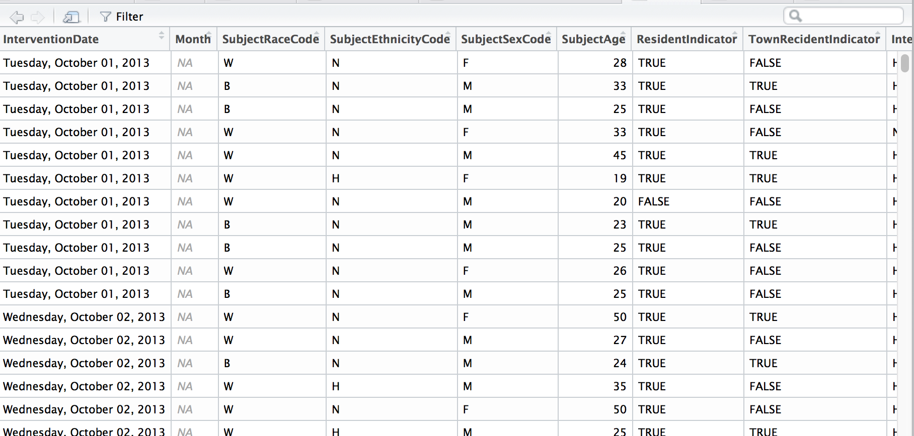
Let’s get rid of some of the bad data– where there was no latitude or longitude data (Don’t worry, that’s only about two percent of the data).
stops <- filter(stops, InterventionLocationLatitude!=0)Let’s map what we’ve got. Let’s download the Census tract shape files in Hamden’s county– New Haven County– with tigris.
# If you don't have tigris installed yet, uncomment the line below and run
#install.packages("tigris")

library(tigris)

# set sf option

options(tigris_class = "sf")

new_haven <- tracts(state="CT", county="New Haven", cb=T)

#If cb is set to TRUE, download a generalized (1:500k) counties file. Defaults to FALSE (the most detailed TIGER file).
ggplot(new_haven) +
geom_sf(color="white") +
geom_point(data=stops, aes(x=InterventionLocationLongitude, y=InterventionLocationLatitude), color="red", alpha=0.05) +
#geom_point(data=stops_spatial, aes(x=lon, y=lat), color="blue") +
theme_void() +
theme(panel.grid.major = element_line(colour = 'transparent')) +
labs(title="Traffic stops in Hamden")
Alright, it’s a start.
Deeper analysis
If you have a data set with latitude and longitude information, it’s easy to just throw it on a map with a dot for every instance.
But what would that tell you? You see the intensity of the cluster of dots over the area but that’s it.
If there’s no context or explanation it’s a flashy visualization and that’s it.
Heat map
One way is to visualize the distribution of stops.
We’ll use the stat_density2d() function within ggplot2 and use coord_map() and xlim and ylim to set the boundaries on the map so it’s zoomed in more.
When you’re stacking ggplots or dplyr commands, the line can’t end with a + or a %>% normally, right? Well, if you stick a NULL at the last line, you can have the + or %>% precede it. This is kind of an advanced tip for folks who play around with scripts and are tired of commenting out before the + or %>%.
ggplot() +
  geom_sf(data=new_haven, color = "#777777", fill=NA, size=0.2) +
  stat_density2d(data=stops, show.legend=F, aes(x=InterventionLocationLongitude, y=InterventionLocationLatitude, fill=..level.., alpha=..level..), geom="polygon", size=4, bins=10) +
  scale_fill_gradient(low="deepskyblue2", high="firebrick1", name="Distribution") +
  coord_sf(xlim=c(-73.067649, -72.743739), ylim=c(41.280972, 41.485011)) +
  labs(x=NULL, y=NULL,
                  title="Traffic stops distribution around Hamden",
                  subtitle=NULL,
                  caption="Source: data.ct.gov") +
  theme_void() +
  theme(panel.grid.major = element_line(colour = 'transparent'))
That’s interesting.
What’s nice about ggplot2, is the functionality called facets, which allows the construction of small multiples based on factors.
Let’s try this again but faceted by race.
# Creating a race column
stops$race <- ifelse(stops$SubjectEthnicityCode=="H", "H", stops$SubjectRaceCode)
stops <- stops %>%
  mutate(race=case_when(
    race=="A" ~ "Asian",
    race=="B" ~ "Black",
    race=="H" ~ "Hispanic",
    race=="W" ~ "White"
  ))


ggplot() +
  geom_sf(data=new_haven, color = "black", fill=NA, size=0.5) +
  stat_density2d(data=stops, show.legend=F, aes(x=InterventionLocationLongitude, y=InterventionLocationLatitude, fill=..level.., alpha=..level..), geom="polygon", size=4, bins=10) +
  scale_fill_gradient(low="deepskyblue2", high="firebrick1", name="Distribution") +
  coord_sf(xlim=c(-73.067649, -72.743739), ylim=c(41.280972, 41.485011)) +
  #This is the new line being added
  facet_wrap(~race) +
  labs(x=NULL, y=NULL,
                  title="Traffic stops distribution around Hamden by race",
                  subtitle=NULL,
                  caption="Source: data.ct.gov") +
  theme_void() +
  theme(panel.grid.major = element_line(colour = 'transparent'))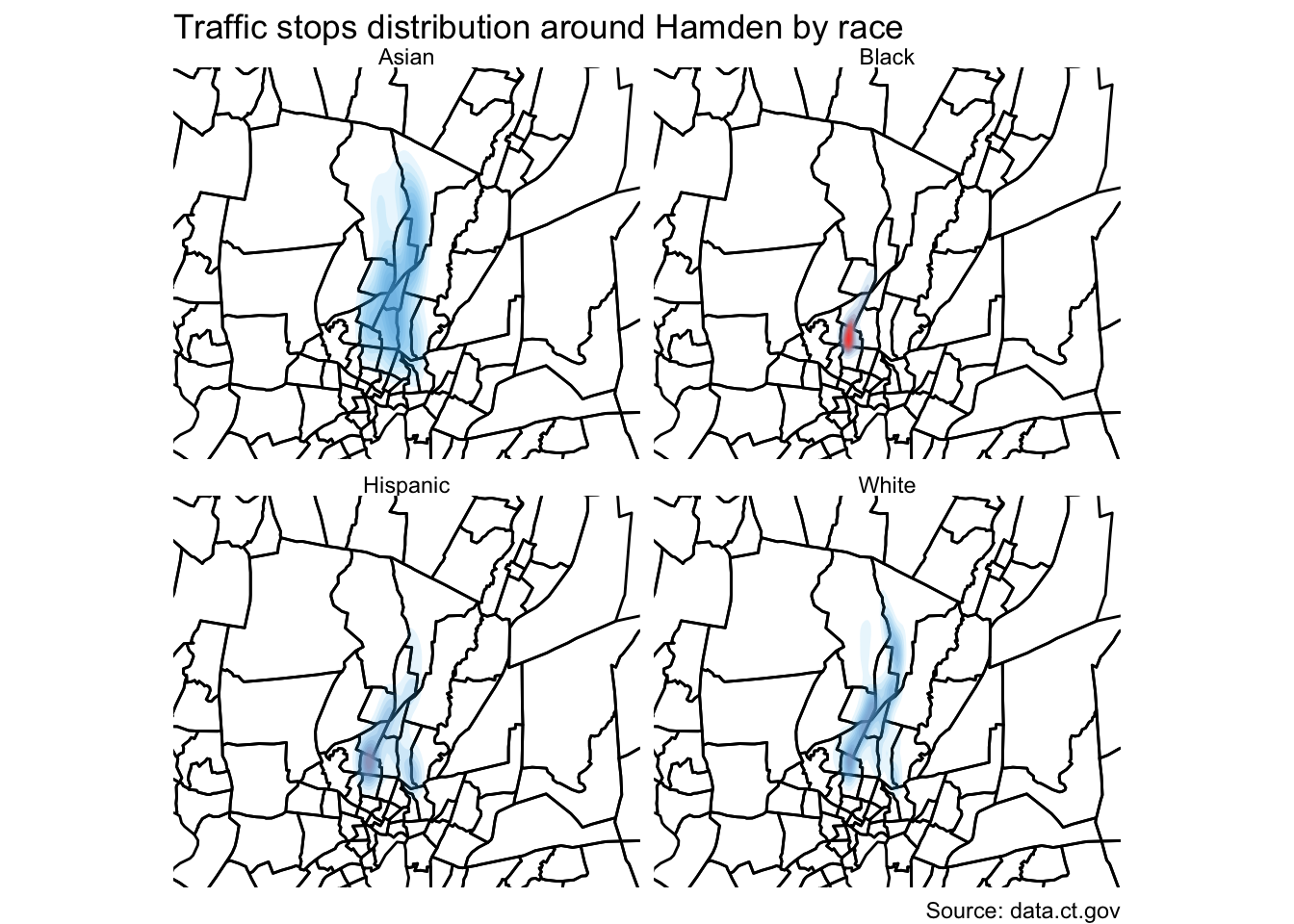
Interesting.
But it still doesn’t tell the full story because it’s still a bit misleading.
Here’s what I mean.
stops %>%
  group_by(race) %>%
  count()
## # A tibble: 4 x 2
## # Groups: race [4]
## race n
## <chr> <int>
## 1 Asian 71
## 2 Black 2035
## 3 Hispanic 444
## 4 White 2808The distribution is comparative to its own group and not as a whole.
Gotta go deeper.
Let’s look at which neighborhoods police tend to pull people over more often and compare it to demographic data from the Census.
So we need to count up the instances with the st_join() function from the sf package.
Points in a Polygon
We already have the shape file of Census tracts in Hamden.
We just need to count up how many times a traffic stop occurred in each tract.
First, let’s make sure it will match the correct coordinate reference system (CRS) as the shape file we’ve just downloaded. We’ll use the st_as_sf() function to create a new geometry with the latitude and longitude data from the stops data frame. And we’ll transform the CRS so it matches the CRS from the new_haven shape file we downloaded.
stops_spatial <- stops %>%
  st_as_sf(coords=c("InterventionLocationLongitude", "InterventionLocationLatitude"), crs = "+proj=longlat") %>%
  st_transform(crs=st_crs(new_haven))
Now we use the spatial_join() function that sees where the geometries we’ve set in stops_spatial fall into which polygon in new_haven.
points_in <- st_join(new_haven, stops_spatial, left=T)View(points_in)
This is great.
What just happened: Every point in the original stops data frame now has a corresponding census tract and has been saved in the points_in data frame.
Now, we can summarize the data by count and merge it back to the shape file and visualize it.
by_tract <- points_in %>%
  filter(!is.na(X)) %>%
  group_by(GEOID) %>%
  summarise(total=n())

head(by_tract)
## Simple feature collection with 6 features and 2 fields
## geometry type: POLYGON
## dimension: XY
## bbox: xmin: -72.97291 ymin: 41.31282 xmax: -72.9033 ymax: 41.35039
## epsg (SRID): 4269
## proj4string: +proj=longlat +datum=NAD83 +no_defs
## # A tibble: 6 x 3
## GEOID total geometry
## <chr> <int> <POLYGON [°]>
## 1 09009141… 6 ((-72.97291 41.3474, -72.96833 41.34797, -72.96767 41.34…
## 2 09009141… 3 ((-72.95252 41.3228, -72.95084 41.32394, -72.94852 41.32…
## 3 09009141… 97 ((-72.94236 41.32899, -72.9397 41.33203, -72.93923 41.33…
## 4 09009141… 1 ((-72.94043 41.31991, -72.94131 41.32058, -72.94048 41.3…
## 5 09009141… 6 ((-72.92738 41.32651, -72.92708 41.32729, -72.92654 41.3…
## 6 09009141… 9 ((-72.91891 41.31964, -72.91649 41.32468, -72.91579 41.3…We have enough here to visualize it.
# If you don't have viridis installed yet, uncomment and runt he line below
#install.packages("viridis")

library(viridis)

ggplot(by_tract) +
  geom_sf(aes(fill = total), color=NA) +
  coord_sf(datum=NA) +
  labs(title = "Total traffic stops by Hamden police",
       subtitle = "In 2013 and 2014",
       caption = "Source: data.ct.gov",
       fill = "Total stops") +
  scale_fill_viridis(option="magma", direction=-1)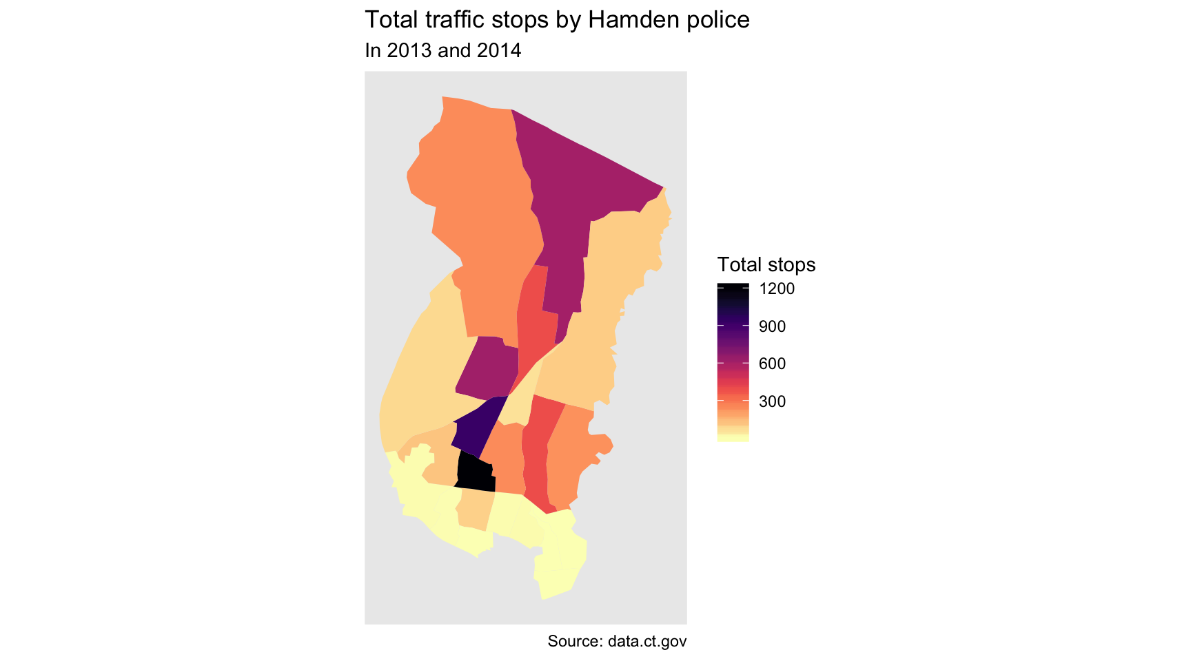
Pretty, but we’re unclear which part is Hamden and which are parts of other towns.
That’s fine because we can layer in a tract of Hamden only with tigris.
new_haven_towns <- county_subdivisions(state="CT", county="New Haven", cb=T)
hamden_town <- filter(new_haven_towns, NAME=="Hamden")
We’ve got a single polygon for Hamden now. Let’s place it on top of our other map layers with a second geom_sf().
ggplot() +
  geom_sf(data=by_tract, aes(fill = total), color=NA) +
  geom_sf(data=hamden_town, fill=NA, color="black") +
  coord_sf(datum=NA) +
  labs(title = "Total traffic stops by Hamden police",
       subtitle = "In 2013 and 2014",
       caption = "Source: data.ct.gov",
       fill = "Total stops") +
  scale_fill_viridis(option="magma", direction=-1) +
NULL
Alright, excellent.
It’s much clearer now that the bulk of the traffic stops occur at the southern border of Hamden.
We can go deeper by going to our joined data frame and summarize by race and adding more variables to group_by()
by_tract_race <- points_in %>%
  filter(!is.na(X)) %>%
  group_by(GEOID, race) %>%
  summarise(total=n())

head(by_tract_race)
## Simple feature collection with 6 features and 3 fields
## geometry type: POLYGON
## dimension: XY
## bbox: xmin: -72.97291 ymin: 41.31666 xmax: -72.9249 ymax: 41.35039
## epsg (SRID): 4269
## proj4string: +proj=longlat +datum=NAD83 +no_defs
## # A tibble: 6 x 4
## # Groups: GEOID [3]
## GEOID race total geometry
## <chr> <chr> <int> <POLYGON [°]>
## 1 09009141… Black 5 ((-72.97291 41.3474, -72.96833 41.34797, -72.9676…
## 2 09009141… White 1 ((-72.97291 41.3474, -72.96833 41.34797, -72.9676…
## 3 09009141… Black 2 ((-72.95252 41.3228, -72.95084 41.32394, -72.9485…
## 4 09009141… White 1 ((-72.95252 41.3228, -72.95084 41.32394, -72.9485…
## 5 09009141… Black 73 ((-72.94236 41.32899, -72.9397 41.33203, -72.9392…
## 6 09009141… Hispa… 7 ((-72.94236 41.32899, -72.9397 41.33203, -72.9392…Very tidy data frame!
We can repurpose the map code above and add a single line of code to facet it.
ggplot() +
  geom_sf(data=by_tract_race, aes(fill = total), color=NA) +
  geom_sf(data=hamden_town, fill=NA, color="black") +
  coord_sf(datum=NA) +
  labs(title = "Total traffic stops by Hamden police",
       subtitle = "In 2013 and 2014",
       caption = "Source: data.ct.gov",
       fill = "Total stops") +
  scale_fill_viridis(option="magma", direction=-1) +
  facet_wrap(~race)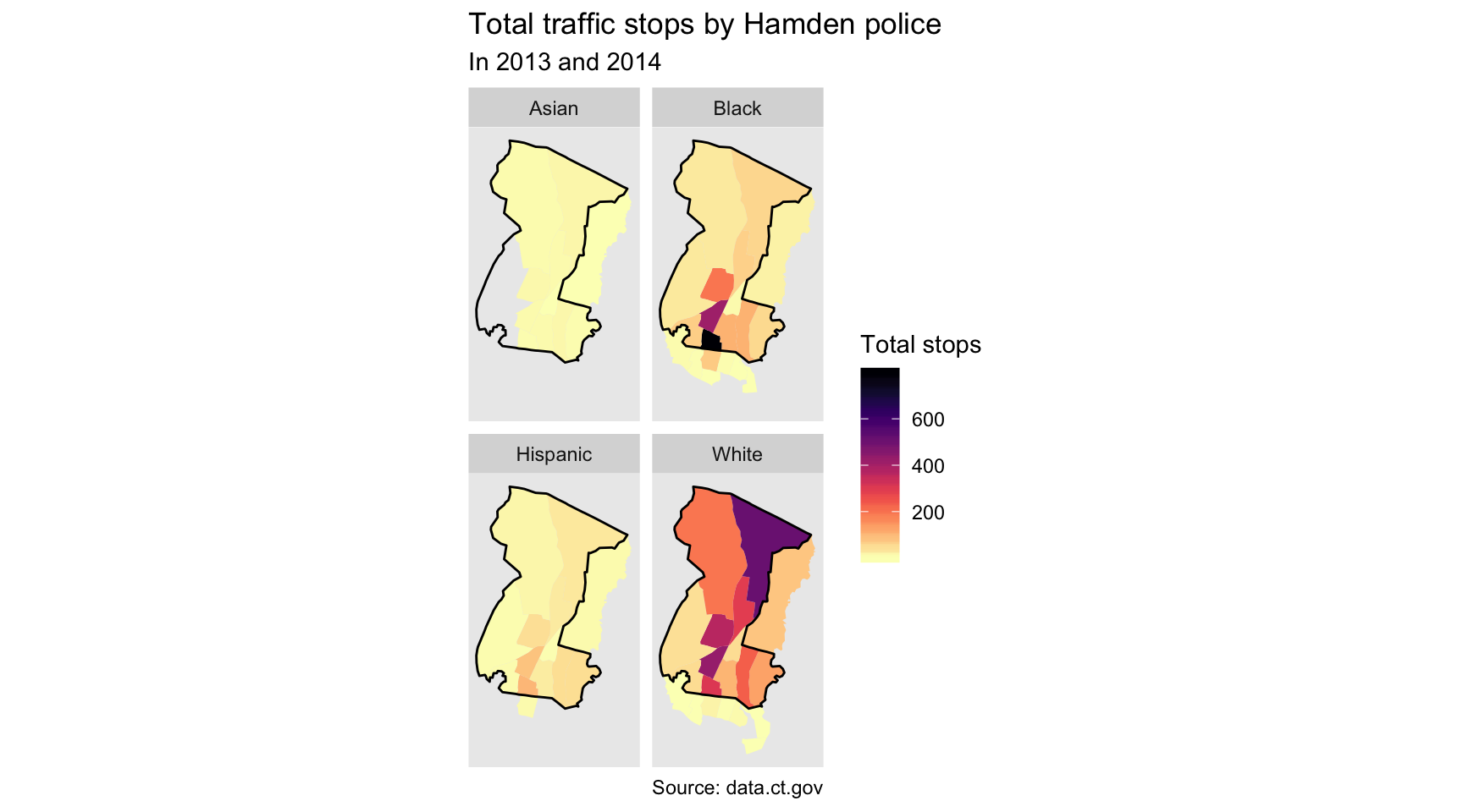
Well, that’s pretty revealing.
So these are raw numbers. Let’s try to figure out the percent breakdown of drivers who are White versus those who aren’t per Census tract. We just have to wrangle by_tract_race data frame a little bit. We’ve done this before in previous sections.
by_tract_race_percent <- by_tract_race %>%
  mutate(type=case_when(
    race=="White" ~ "White",
    TRUE ~ "Minority")) %>%
  group_by(GEOID, type) %>%
  summarize(total=sum(total)) %>%
  mutate(percent=round(total/sum(total, na.rm=T)*100,2))

head(by_tract_race_percent)
## Simple feature collection with 6 features and 4 fields
## geometry type: POLYGON
## dimension: XY
## bbox: xmin: -72.97291 ymin: 41.31666 xmax: -72.9249 ymax: 41.35039
## epsg (SRID): 4269
## proj4string: +proj=longlat +datum=NAD83 +no_defs
## # A tibble: 6 x 5
## # Groups: GEOID [3]
## GEOID type total percent geometry
## <chr> <chr> <int> <dbl> <POLYGON [°]>
## 1 0900914… Minor… 5 83.3 ((-72.97291 41.3474, -72.96833 41.34797, -…
## 2 0900914… White 1 16.7 ((-72.97291 41.3474, -72.96833 41.34797, -…
## 3 0900914… Minor… 2 66.7 ((-72.95252 41.3228, -72.95084 41.32394, -…
## 4 0900914… White 1 33.3 ((-72.95252 41.3228, -72.95084 41.32394, -…
## 5 0900914… Minor… 80 82.5 ((-72.94236 41.32899, -72.9397 41.33203, -…
## 6 0900914… White 17 17.5 ((-72.94236 41.32899, -72.9397 41.33203, -…We can easily plot this.
ggplot() +
  geom_sf(data=by_tract_race_percent, aes(fill = percent), color=NA) +
  geom_sf(data=hamden_town, fill=NA, color="black") +
  coord_sf(datum=NA) +
  labs(title = "Total traffic stops by Hamden police",
       subtitle = "In 2013 and 2014",
       caption = "Source: data.ct.gov",
       fill = "Percent of all stops") +
  scale_fill_viridis(option="magma", direction=-1) +
  facet_wrap(~type)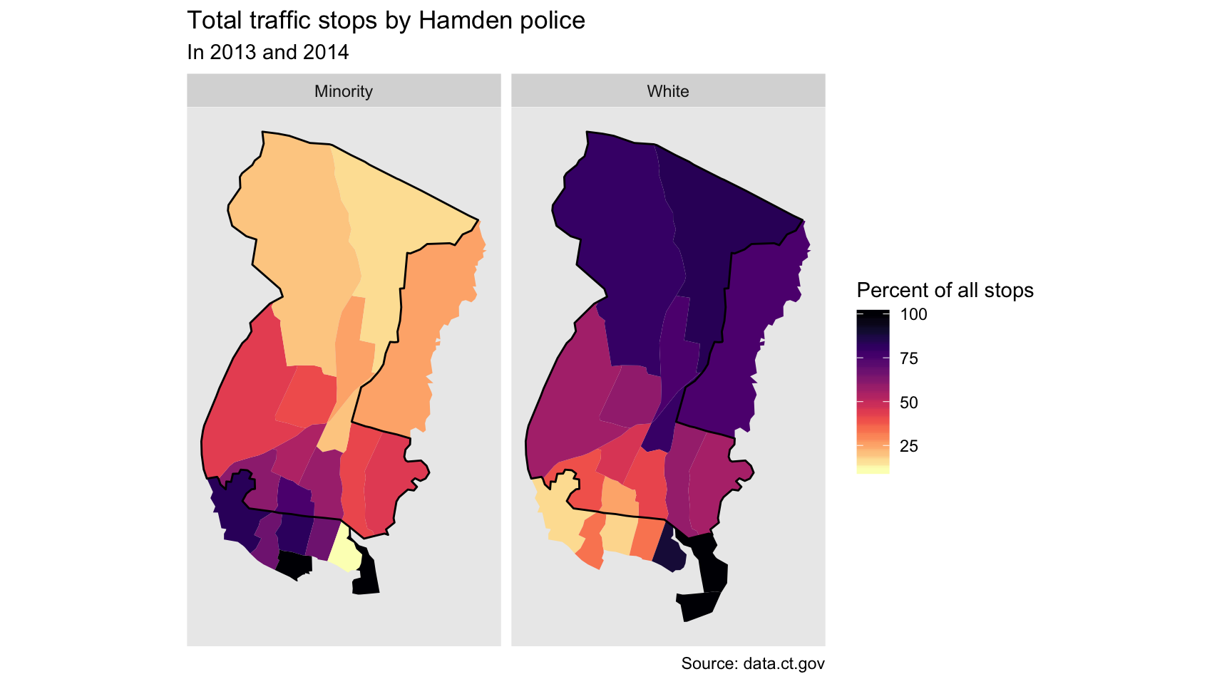
So that’s even more stark difference.
What’s it tell us? Most of the stops up north are White drivers.
Most of the stops in the southern part of the town, particularly by the town border, are Minority drivers.
What’s one argument that could explain this?
“Well, maybe that’s where minorities live.”
Perhaps. But we can measure that thanks to the Census.
We know the percent make up of traffic steps in Hamden.
Let’s calculate the percent make up of residents in those neighborhoods and compare them.
Ideally, the rate of traffic stops should match the rate of residents, right?
We’ll use the tidycensus package.
Don’t forget to load your Census API key.
census_api_key("YOUR API KEY GOES HERE")## To install your API key for use in future sessions, run this function with `install = TRUE`.racevars <- c(Total_Pop = "B02001_001E",
White_Pop = "B02001_002E")
hamden_pop <- get_acs(geography = "tract", variables = racevars,
state = "CT", county = "New Haven County")
head(hamden_pop)Great, we have total population and white population per tract.
Let’s summarize this data by GEOID.
library(tidyr)

hamden_pop_perc <- hamden_pop %>%
  mutate(variable=case_when(
    variable=="B02001_001" ~ "Total",
    variable=="B02001_002" ~ "White")) %>%
  # dropping Margin of Error-- I know this is not ideal but for this purpose, we'll get rid of it for now
  select(-moe) %>%
  spread(variable, estimate) %>%
  mutate(white_residents=round(White/Total*100,2), minority_residents=100-white_residents)

head(hamden_pop_perc)
## # A tibble: 6 x 6
## GEOID NAME Total White white_residents minority_reside…
## <chr> <chr> <dbl> <dbl> <dbl> <dbl>
## 1 090091… Census Tract 1201, … 6134 5114 83.4 16.6
## 2 090091… Census Tract 1202, … 6566 5377 81.9 18.1
## 3 090091… Census Tract 1251, … 4652 4171 89.7 10.3
## 4 090091… Census Tract 1252, … 5828 4623 79.3 20.7
## 5 090091… Census Tract 1253, … 5184 3227 62.2 37.8
## 6 090091… Census Tract 1254, … 3289 2330 70.8 29.2Nice. Let’s join it back to the by_tract_race_percent dataframe so we can calculate the gap.
by_tract_race_percent_spread <- by_tract_race_percent %>%
  select(-total) %>%
  spread(type, percent) %>%
  rename(minority_stopped=Minority, white_stopped=White) %>%
  filter(!is.na(minority_stopped) & !is.na(white_stopped))

stops_population <- left_join(by_tract_race_percent_spread, hamden_pop_perc) 
Great. Let’s do some math real quick and visualize what we have with a diverging color palette from the scales package.
# If you don't have scales installed yet, uncomment and run the line below
#install.packages("scales")

library(scales)

stops_population$gap <- (stops_population$minority_stopped - stops_population$minority_residents)/100

ggplot() +
  geom_sf(data=stops_population, aes(fill = gap), color="white", size=.25) +
  geom_sf(data=hamden_town, fill=NA, color="black") +
  coord_sf(datum=NA) +
  labs(title = "Hamden: Minority traffic stops versus population",
       subtitle = "In 2013 and 2014",
       caption = "Source: data.ct.gov") +
  scale_fill_distiller(type="seq", trans="reverse", palette = "PuOr", label=percent, breaks=pretty_breaks(n=10), name="Gap") +
  #continuous_scale(limits=c(-30, 30)) +
  theme_void() +
  theme(panel.grid.major = element_line(colour = 'transparent')) +
NULL
Add annotations to graphic
We’ll use the annotate() function with a combination of segments, points, and text.
stops_population$gap <- (stops_population$minority_stopped - stops_population$minority_residents)/100

ggplot() +
  geom_sf(data=stops_population, aes(fill = gap), color="white", size=.25) +
  geom_sf(data=hamden_town, fill=NA, color="black") +
  coord_sf(datum=NA) +
  labs(title = "Hamden: Minority traffic stops versus population",
       subtitle = "In 2013 and 2014",
       caption = "Source: data.ct.gov") +
  scale_fill_distiller(type="seq", trans="reverse", palette = "PuOr", label=percent, breaks=pretty_breaks(n=10), name="Gap") +
  #continuous_scale(limits=c(-30, 30)) +
  theme_void() +
  theme(panel.grid.major = element_line(colour = 'transparent')) +
  # NEW CODE HERE
  annotate("segment", x = -72.93, xend = -72.87, y = 41.325, yend = 41.325, colour = "lightblue", size=.5) +
  annotate("point", x = -72.93, y = 41.325, colour = "lightblue", size = 2) +
  annotate("text", x = -72.85, y = 41.325, label = "New Haven", size=5, colour="gray30") +
  annotate("segment", x = -72.89, xend = -72.86, y = 41.375, yend = 41.375, colour = "lightblue", size=.5) +
  annotate("point", x = -72.89, y = 41.375, colour = "lightblue", size = 2) +
  annotate("text", x = -72.845, y = 41.375, label = "North Haven", size=5, colour="gray30") +
  annotate("point", x = -72.83, y = 41.375, colour="white", size=.2) +

NULL
© Copyright 2018, Andrew Ba Tran